492-Cultural Complex
Hoofddorp
NETHERLANDS
16.441 sqm (new building) / 22.493 sqm (total); (2005); (01-492).
Invited competition entry
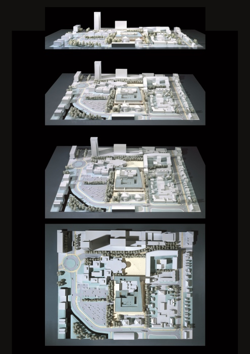
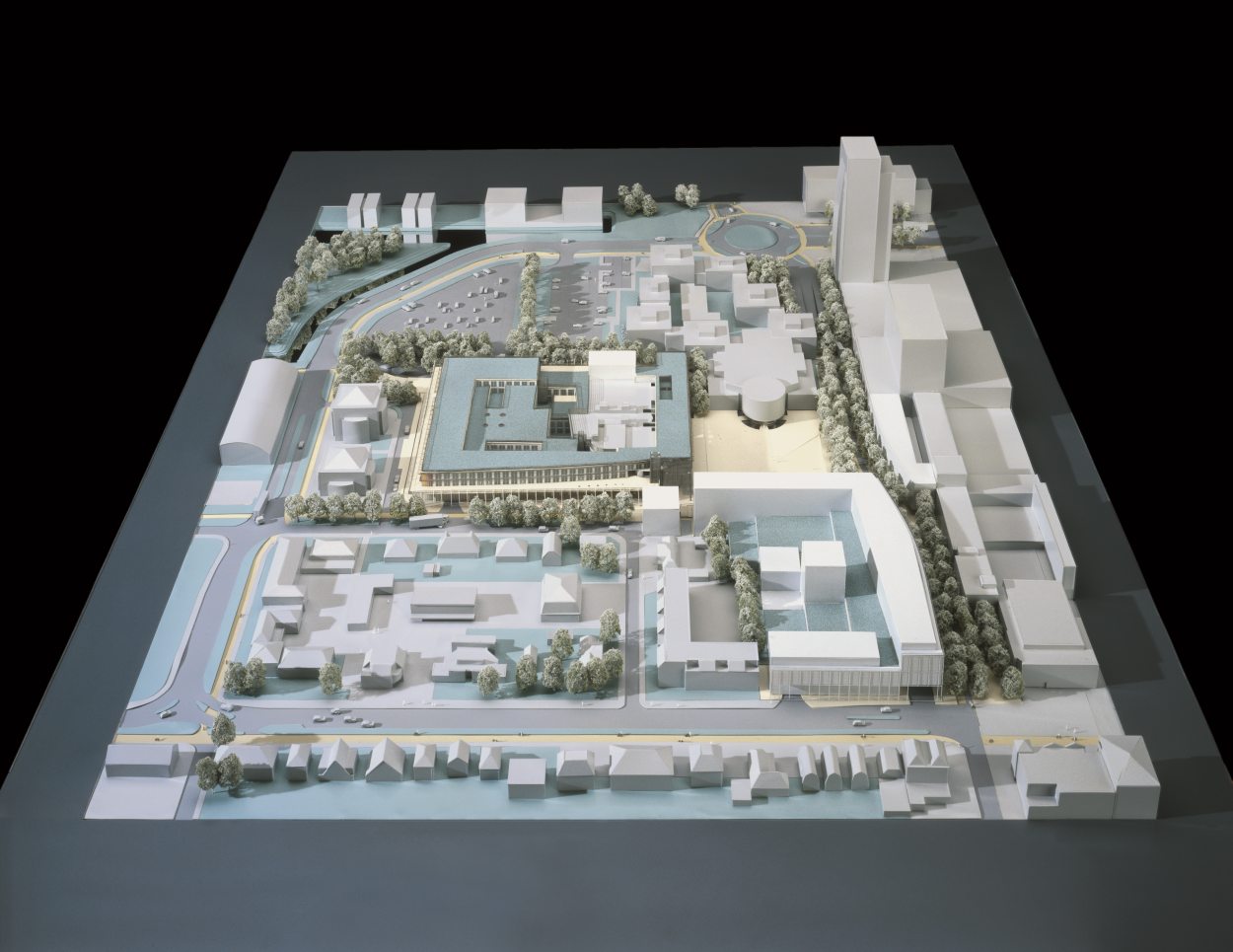
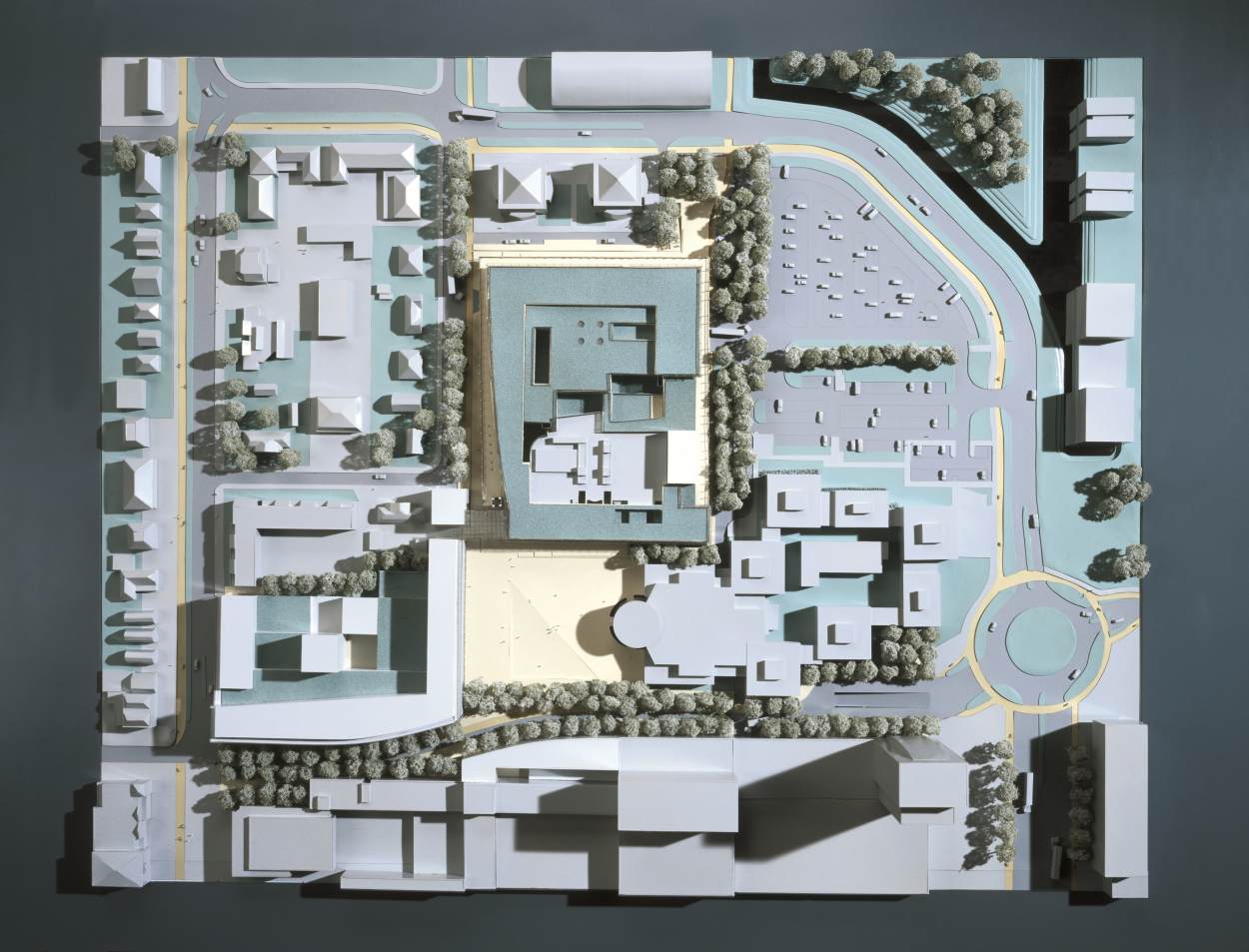
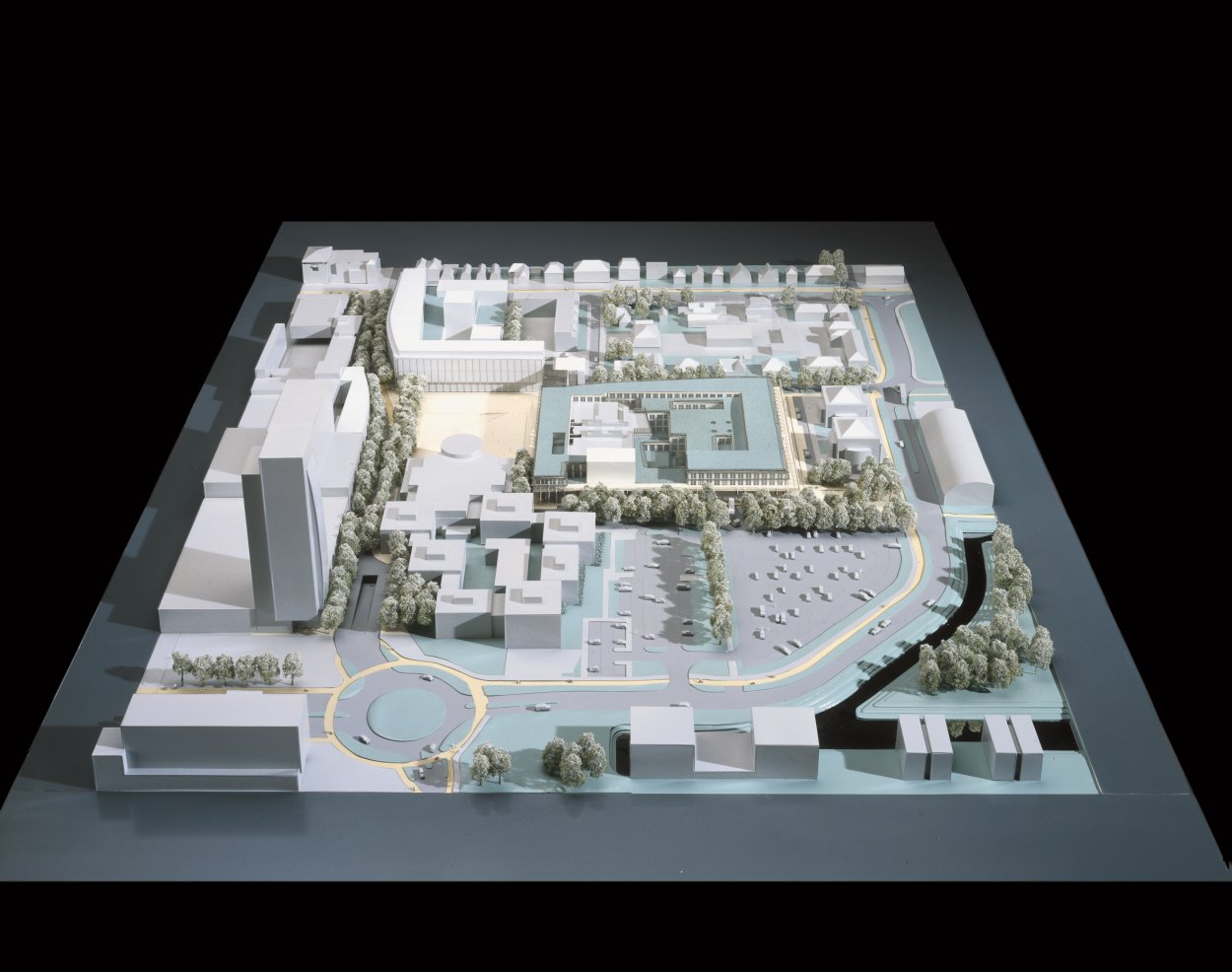
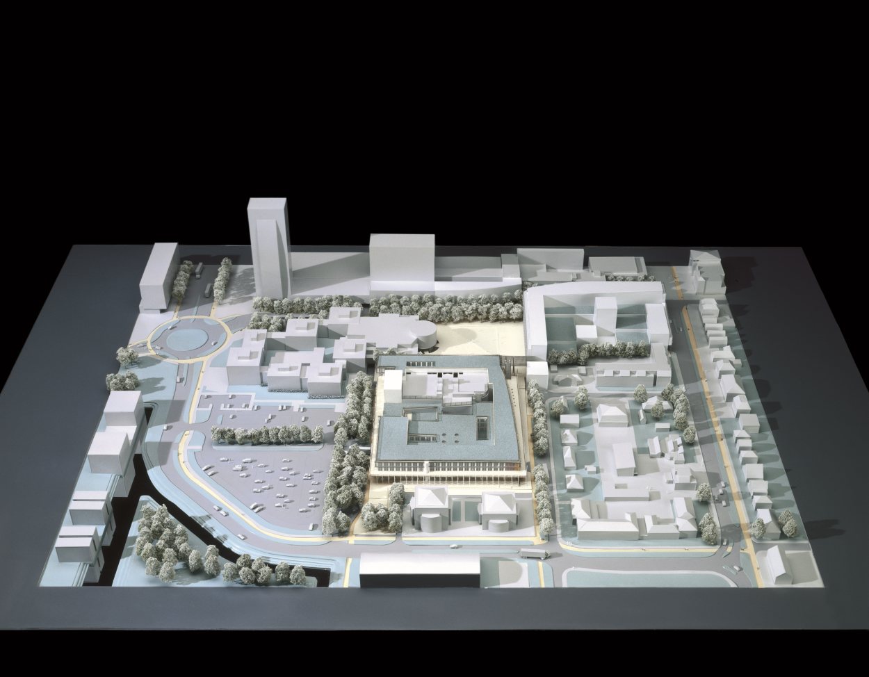
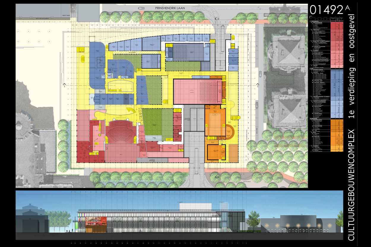
The brief of this project is twofold: on the one hand, a master plan for the totality of the “Cultuurplein” zone including the renovation of the public square; on the other hand, a proposal for the extension of the existing De Meerse building. This theater, which includes an arts school, is to become an integral part of an authentic complex of cultural buildings with an extension of The Center for Arts and Culture and the addition of a Pop Music hall as well as the new public library of the municipality of Hoofddorp.
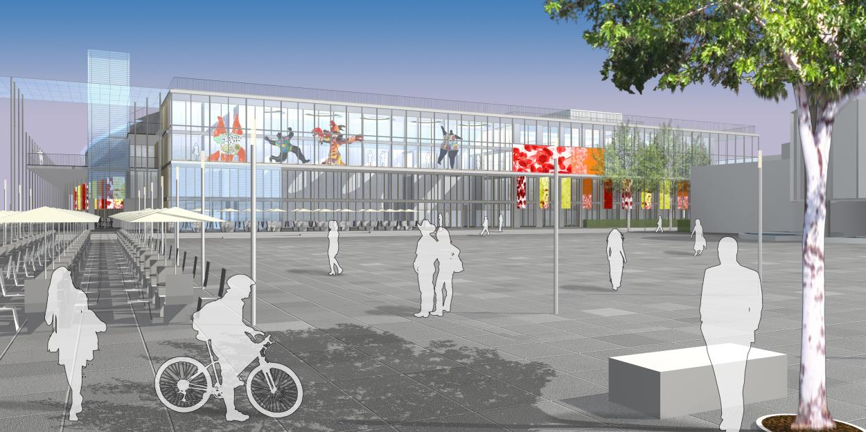
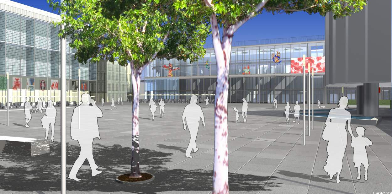
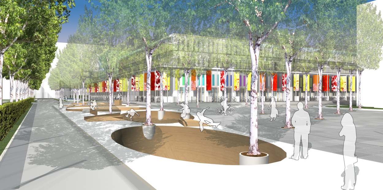
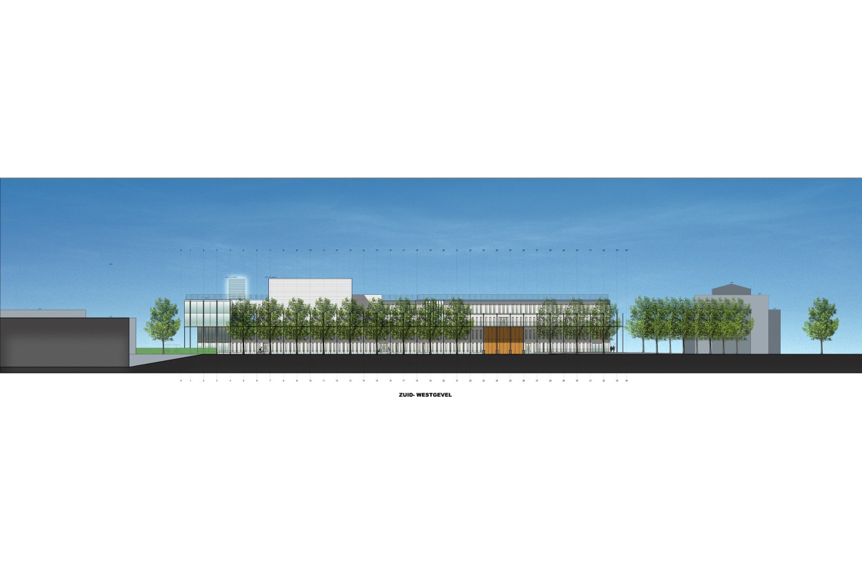
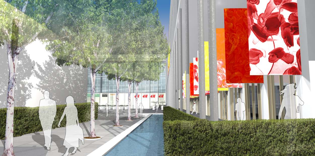
The new Cultuurplein becomes the “piazzetta” of Hoofddorp, the pivotal point of a renewed civic complex. The variations in the levels of the renovated spaces of the public square offer neighboring areas a visual ensemble of terraces and zones of encounter. Placed on a pedestal, the building of the cultural complex focuses the attentions without being pretentious. In front of the cultural complex a double row of trees creates a green loggia of the public square: an area of relaxation bathed in morning sunlight and protected by an awning of greenery.
The public square is thus characterized by an ambiance of sunshine and clemency on the small terraces located before the Aprisco housing estate, by the sustainable safety with regards to the circulation along the Nieuweweg, by the town hall—a symbol of both authority and openness—and most of all by the celebration of culture on the terraces and the stairways of the new complex of buildings.
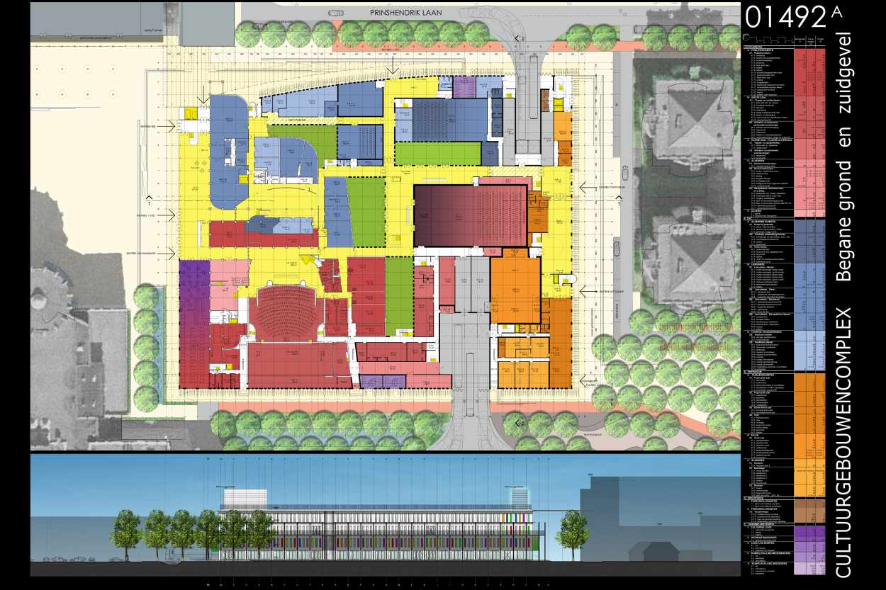
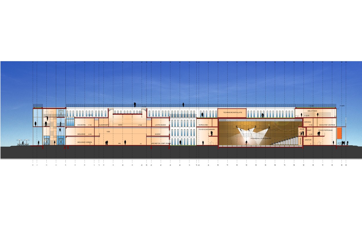
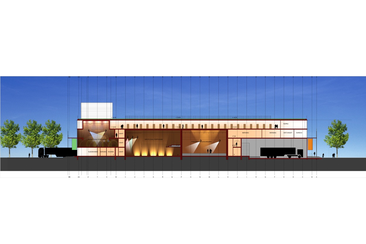
The extension of the De Meerse building includes, among other elements, two large halls with room for classes, workshops, staff and service courts. The new Pop Music hall includes a large room for shows, a smaller room for the principal use of the Artquake foundation, as well as rooms for classes and offices. The public library is also completely new and includes a level dedicated to administrative activities, with a level dedicated to public use above it.
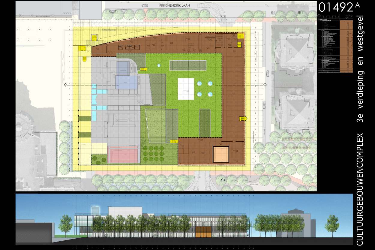
The complexity of the purposes of this project and the precisely delimited site thus result in a renovation where cultural activities accessible to all, theater, the school of arts and the Pop Music hall are grouped on the first three levels and the public library is located in an oasis of calm on the top floor. This allows for future vertical extension of the public library as well.
The present structure of the De Meerse building is respected in the context of this renovation. The new project will be added using the grid of concrete columns distanced 3.6 meters from one another. A gallery situated around the existing building will preserve the two highest levels from costly solar heat supply.
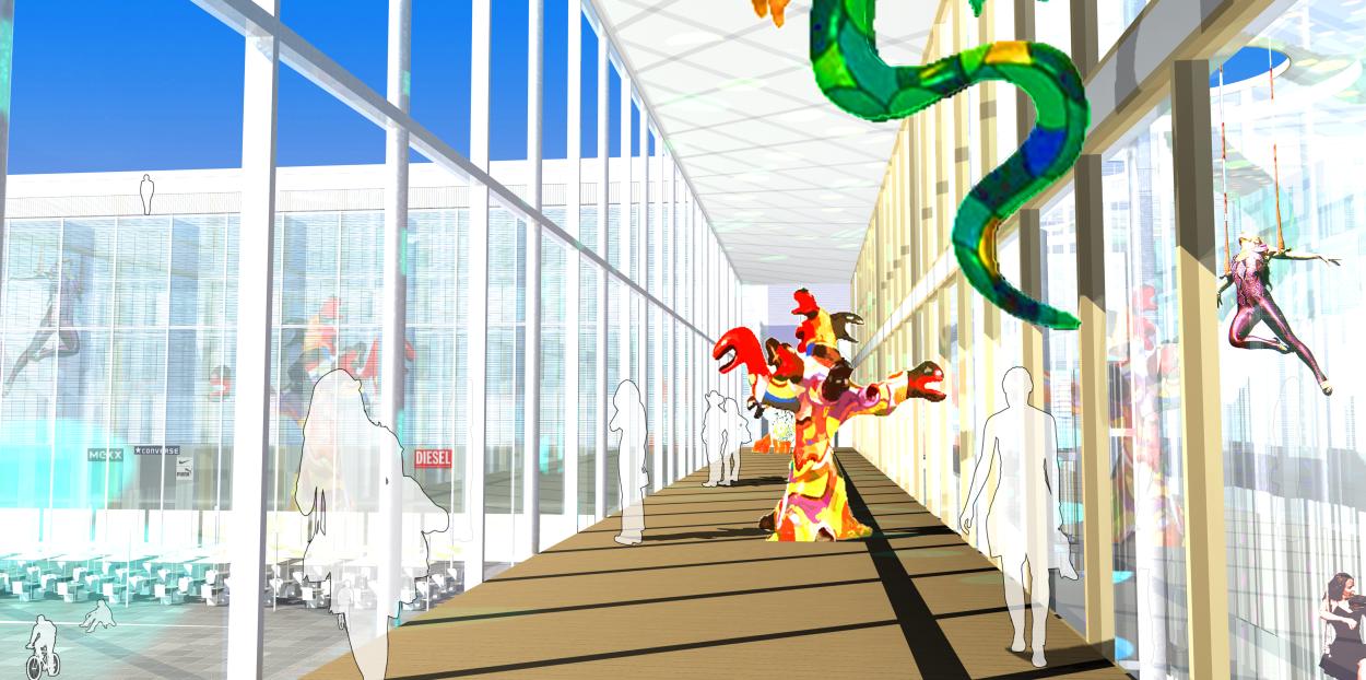
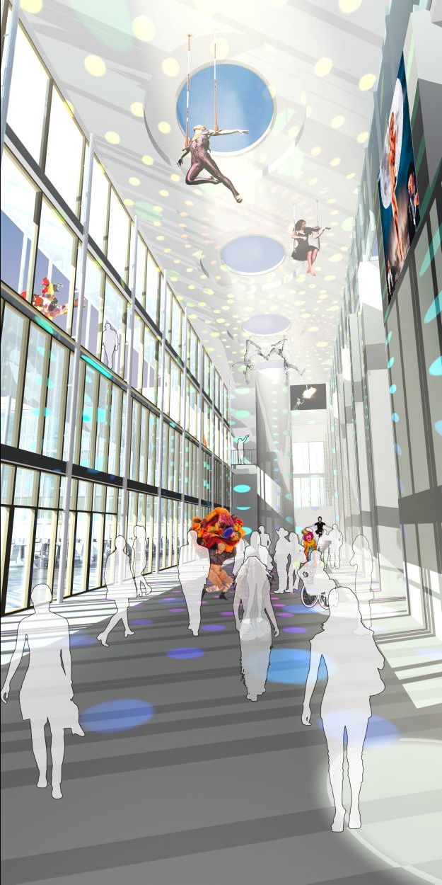
At the front of the building a pleasant glassed bay area serves as the reception hall, an exhibition hall, an information center, the theater and restaurant, the cultural café and visitor information center. It immediately immerses the visitors in a kind of melting pot of cultural possibilities as he ambles through the space even before proceeding to any specific activity or manifestation.
Thus the dialogue between the various cultural programs, as well as the dialogue between the existing building and the new extension is carefully articulated around the public areas. Clear and readable public circulation routes connect the different functions and take the visitor along the interior gardens and the foyers that animate the structure and orient the promenade.
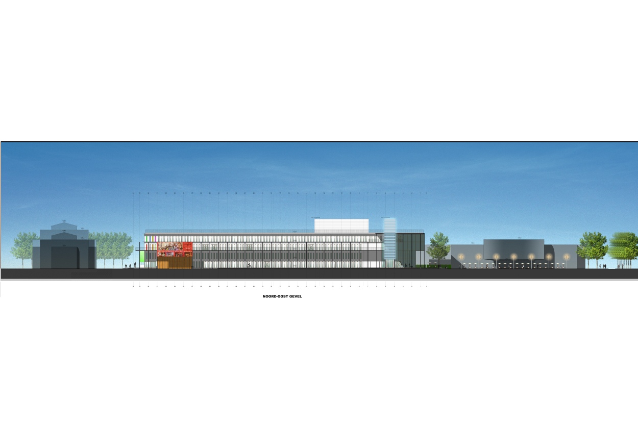
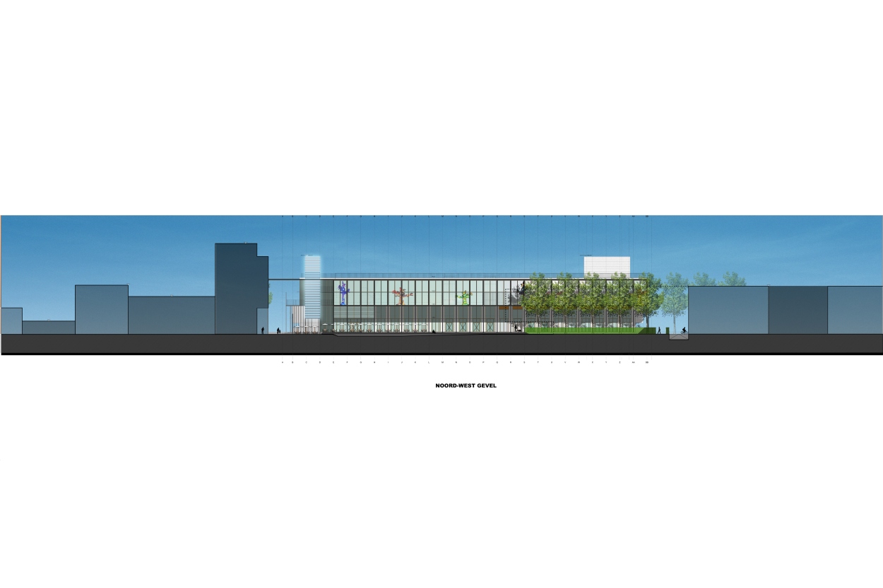
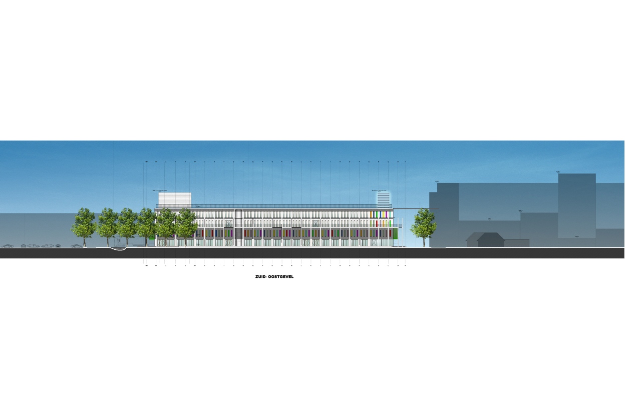
The four facades of the building are dressed with white Trespa panels and with wooden window frames and clear glass windows. The disposition of the windows is regular and, like the wooden window frames themselves, guarantee an economical approach. At the level of the foyers, the façade is elaborated as a structure of concrete columns on which the wooden window frames are anchored. It is not the architect that attributes color to the building itself, but rather its inhabitants and the various artists within. The building therefore includes vast exhibition halls, both interior and exterior. The glassed bay areas, posters, panels for posters, protective screens…give this project a powerful cultural character.
The gallery with its metallic structure surrounds the building at the level of the second floor and covers the bicycle parking areas. This steel terrace with its epoxy covered ribbed flooring (if the budget allows) as well as its metallic grid that surrounds the third floor and an optional glass awning that borders the roof protects the material used for the façade. Posters and banners hang from a 7.20 grid below the gallery. All programs (exhibitions, manifestations, historical information on the municipality of Hoofddorp…) can be displayed there.
The entrance to the library is marked by an urban lamppost or a luminous column.
The materials used are entirely natural, easy to maintain, economical and long-lasting. At the street level, unfinished concrete flooring or a natural vinyl floor treatment can be envisaged. The visible concrete ceilings can be used where possible as an acoustical feature.
Document E41_01/492 -En Issue of 2006-06-19
Philippe SAMYN and PARTNERS All projects are designed by Philippe Samyn who also supervises every drawing
Philippe SAMYN and PARTNERS with SETESCO (sister company 1986-2006) or INGENIEURSBUREAU MEIJER (sister company 2007 – 2015) if not mentioned
Philippe SAMYN and PARTNERS with FTI (sister company since 1989) if not mentioned
| 01-492 | CULTURAL COMPLEX |
| Client: | CITY OF hoofddorp. |
| Architecture: | Partner in charge : L. Gestels. Associates : A. Böhlke, J.-P. Buse, J. De Coninck, F. de Costanzo, R. Fichant, M. Franssen, V. Holvoet, C. Janssens, J.-F. Joiret, S. Konincks, S. Pieters, J. Raman, Th. Vandeweyer, Th. Van De Casteele, D. Vens, K. Verkaik, Th. Wynen. |
Invited competition entry.
For plans sections and elevations, please refer to the archives section of the site available from the “references” menu.

