598-Operations centre for Brutele-Voo
Aéropôle de Charleroi, rue des Frères Wright
Goselies
BELGIUM
(2012); (01-598).
Invited competition entry; preliminary design
– Architecture
– Building physics and internal climate
– Civil engineering
– Cost control
– Daylighting
– Interior design
– Landscaping
– Structural engineering
– Building services engineering
The client wishes to gather its activities into a single operations centre, including the management, the various administrative departments, the dispatching of technicians working at the customer service department and a customer front office.
Document E41_01/598 -En Issue of 2012-11-22
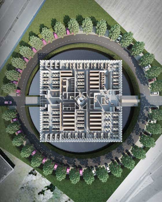
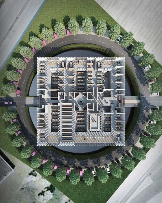
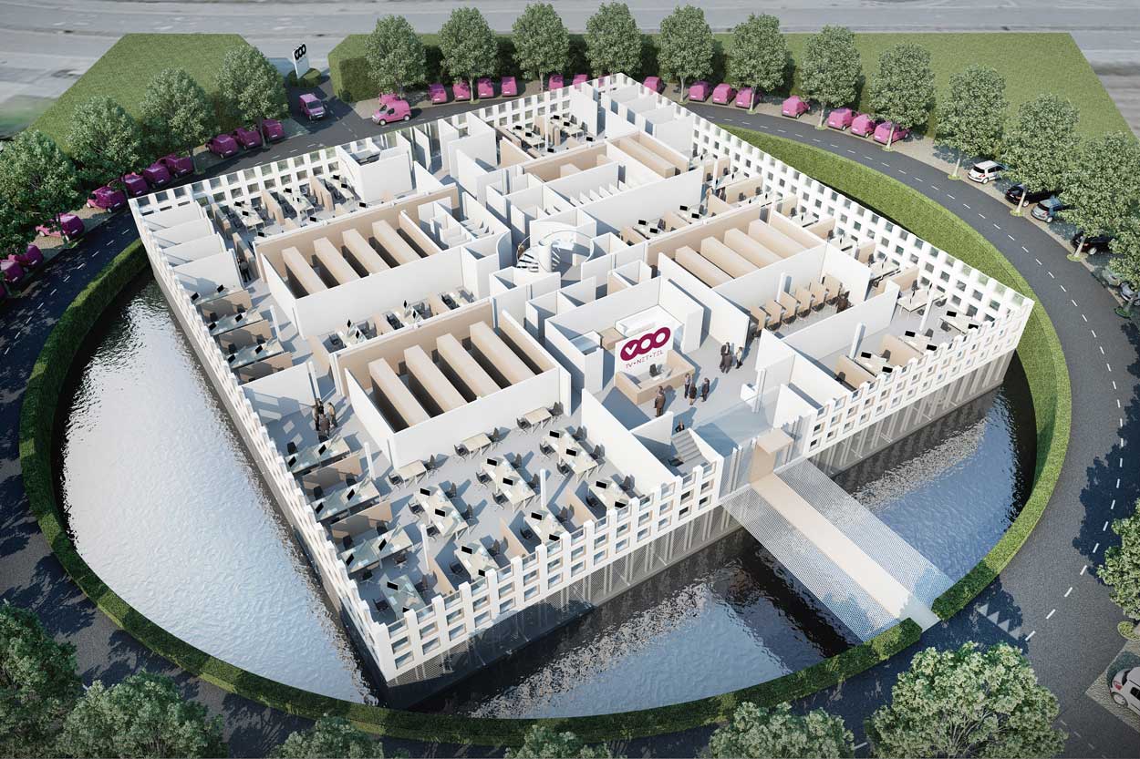
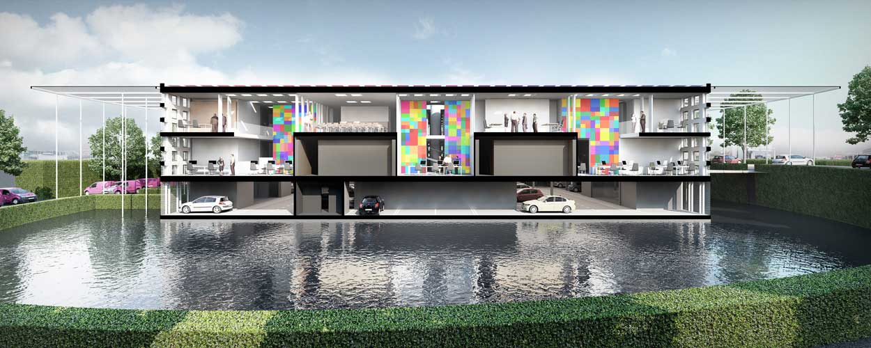
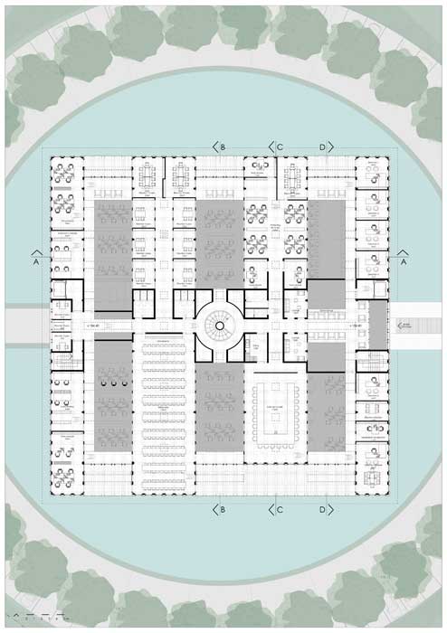
The seemingly contradictory search for a highly compact building with ample natural lighting leads to a building design with a square floor plan, with edges of 45.22 m, two storeys high. In this configuration, in addition to windows on the sides, overhead natural lighting brings abundant light to the centre of the building, in six small double-height atriums.
The distribution of office space over only two floors is a benefit as this arrangement has fire safety requirements that are particularly limited.
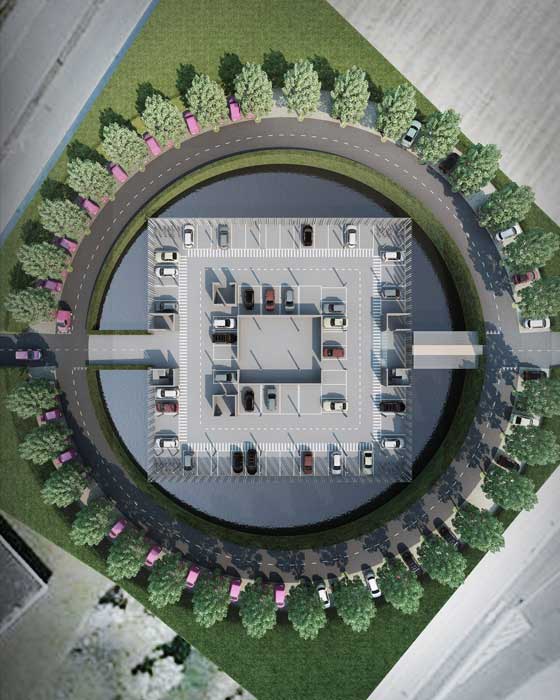
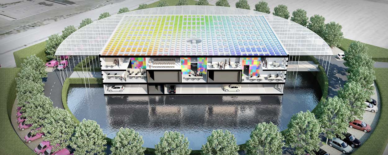
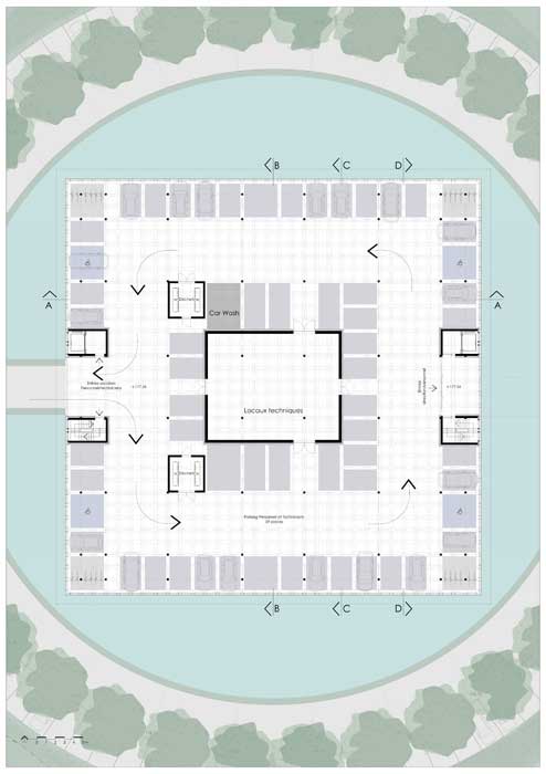
Exploiting the height difference between the two roads bordering the site, the office building is placed on piles and covers a staff car park that is accessible on the same level via the west entrance, as well as the technical areas. The remaining 150 parking spaces are spread along a large, circular ramp with a gentle gradient which connects the two entrances.
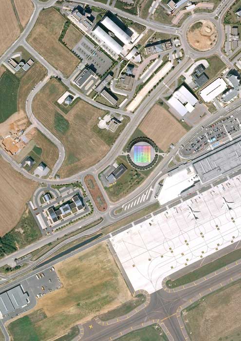
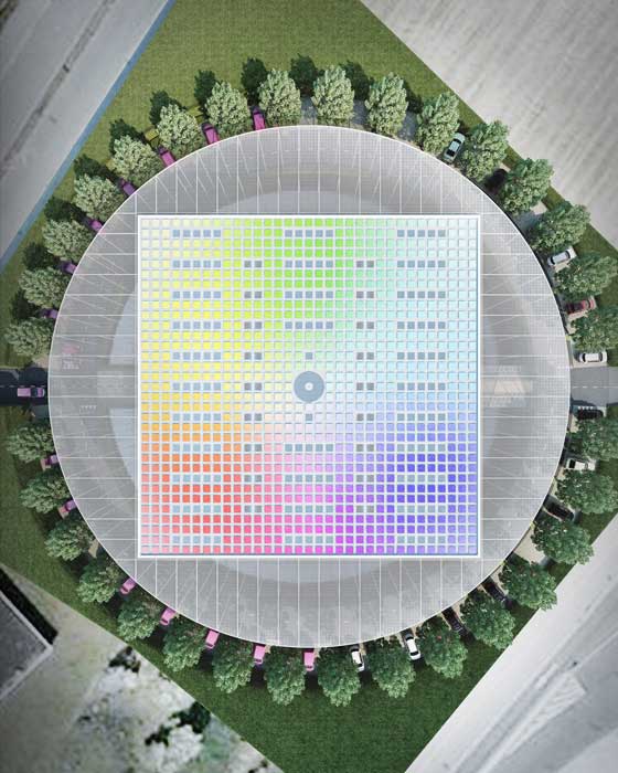
The building is at 45° to the roads. It faces the four cardinal points, like a sundial showing the sun’s path. This angled arrangements reduces the length of private roads and connects these to the adjacent roads at an open angle which is very convenient for drivers. The main entrance provides access to the ground floor and, facing east, provides light without backlighting personnel or visitors arriving in the morning.
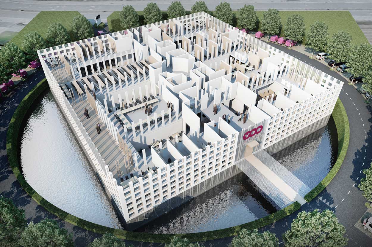
The five terraces of the first floor face north and south, avoiding visual discomfort from the sun being low on the horizon. Their covering protects them from the sun effectively.
The land that is not built on is densely planted around the parking ring, following a strict geometric layout which characterises the outside space, in dialogue with the building and in contrast with the unstructured layout of the surroundings.
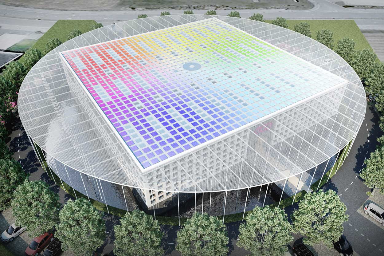
On the lower level, an ornamental pond completely surrounds the building, which is reflected in it. It connects the building to the landscape calmly and softly, while acting as a storm-water basin and reservoir to supply sanitary facilities.
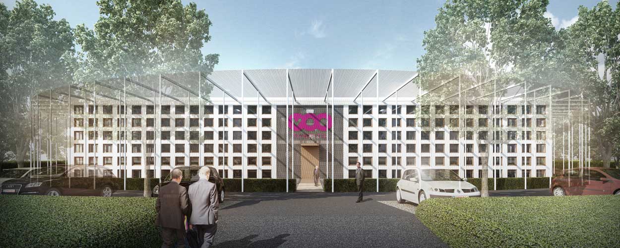
The four sides, plain and with identical proportions, are distinct from one another. They appear as flat surfaces, smooth and white, pierced with small, almost square windows. Combined with the roof, they form a monolithic building in the middle of a green setting.
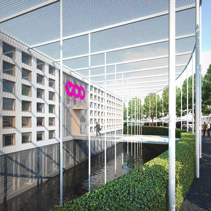
Large openings bring these smooth surfaces to life and ‘tell the story’ of the building: the entrance hall to the east, the transfer hub to the west, terraces to the north and south. These openings are gently closed, in line with the facades, by thin perforated sheet-metal screens which build up the monolithic appearance of the building. With 50% of the surface as perforations, these screens do not block the view of the outside and provide protection against the rain and the wind. A similar perforated screen surrounds the covered car park at level -1.
The roof makes up the fifth side of the building. The skylights on it are arranged regularly. They are incorporated into a work of art in the form of an even network of solar panels of varying colours, arranged according to a design by the artist, Marin Kasimir. All of the technical areas are located on level -1, the roof is not cluttered with any technical equipment.
The fifth side is also lined with a large circular perforated sheet-metal canopy, supported by very slender columns, aligned with the internal edge of the parking ring.
The inside of the building appears as a series or four narrow building wings (4.5 m along the east and west sides, 8.10 m inside the building) surrounding six small and also narrow atriums (6.75 m), but with double floor height (approx. 7 m). The skylights in the room flood the small atriums with natural light.
The series of building wings with two levels on top of each other and the small double-height atriums under the roof create a sort of ‘spatial respiration’ that avoids any of the monotony of vast, open work spaces.
The four wings are crossed at the centre by a transfer axis, connecting, on two levels, the two vertical circulation cores and providing access to the service areas set on both sides. At the centre of this transfer point is a large, open spiral staircase, lit from above which ensures fluid movement between the two levels.
On the ground floor, a footbridge with a wooden floor provides access from the visitor car park to the reception hall via a double-height airlock. Oak double doors remain open during the day, each door opening outwards and, combined with a small canopy, form a welcoming entrance porch.
On the first floor, there are covered terrasses on the side of small atriums. They can be accessed via a peripheral internal passageway.
The overhead natural lighting provides plenty of high-quality light without being dazzling. The aim is to improve the visual comfort of users and to reduce electricity consumption from artificial lighting, which is the largest item in the operating costs of standard, thermally insulated office building. Fitted with glare and heat protection, achieved here through grating placed above the glass, the reduced size of the skylights allow enough light to enter to provide over 80 % independence. This means that artificial lighting only needs to be turned on for under 20 % of working hours over the year, even in offices located in the small atriums.
Offices located around the outside receive light through the sides through three rows of small windows: one against the ceiling, one midway down and one at the floor. This arrangement spreads the light uniformly without producing large areas of shadow. The upper and lower windows use glass with a very low solar factor, while the windows in the middle are fitted with extra-clear vision glass and an exterior sun blind.
The project underwent, from the competition stage, a Valideo environmental pre-audit and an audit of accessibility for people with reduced mobility.
Philippe SAMYN and PARTNERS
All projects are designed by Philippe Samyn who also supervises every drawing
Philippe SAMYN and PARTNERS
with SETESCO (sister company 1986-2006)
or INGENIEURSBUREAU MEIJER
(sister company 2007-2015)
if not mentioned
Philippe SAMYN and PARTNERS
with FTI (sister company since 1989)
if not mentioned
| 01-598 |
OPERATIONS CENTRE FOR BRUTELE-VOO |
|---|---|
| Client: | GILLION CONSTRUCT sa |
| Architecture: | Design Partner: Philippe Samyn Partner in charge: Denis MÉLOTTE Collaborators: France DEFRENNE, Blandine CAPELLE, Elodie NOORBERGEN, Matthijs STOFFELS, Paula FERNANDEZ LOBERA, Valeria COLAVITA, André TAJCHMAN |
| Services: | VALIDEO support and audit: SECO scrl (Philippe DE MEY) Accessibility: PLAIN-PIED asbl (Xavier ANCIAUX) Environnemental study: AGORA (Serge PEETERS and Léa BUSSELEZ) Topographical survey: DE CEUSTER & ASSOCIES (Bernard DESMEDT) Pictural integration: Georges Meurant |
For plans sections and elevations, please refer to the archives section of the site available from the “references” menu.

