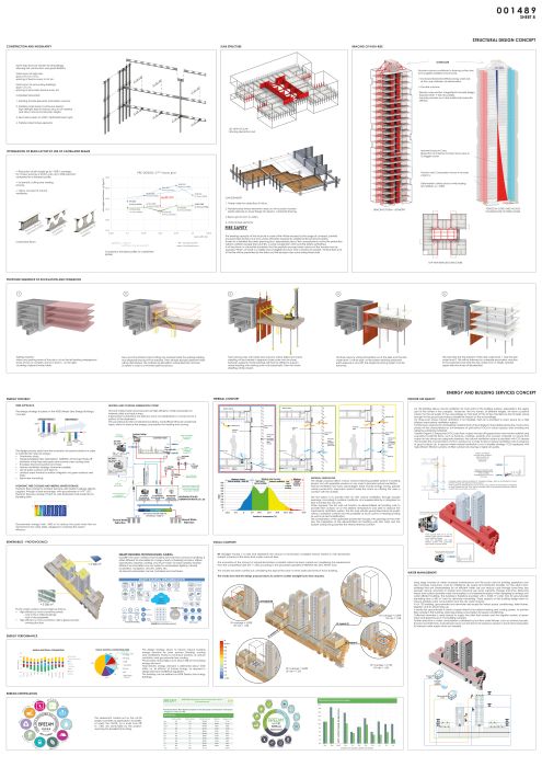
© Rendering: ASYMETRIE
657 – PROJECT “LOI 130”
Rue de la Loi, 130, 1040 Brussels, Belgium
50°50’40”N / 4°22’32”E
240530 sqm ; 2018 ; (01/657).
Invited competition entry.
Competition : Building specification Form D1
- Landscaping (1)
- Architecture (2)
- Interior design (2)
- Structural engineering (3)
- Building services engineering (4)
- Acoustics (5)
- Wind studies (6)
(1) with LAND Italia
(2) with Bouwschlager Eberle Architekten
(3) with schlaich bergermann partner and Bollinger und Grohmann
(4) with Deerns Italia
(5) with A-Tech
(6) with Von Karman Institute for Fluid Dynamics
URBAN DESIGN
An Invitation to The Citizens
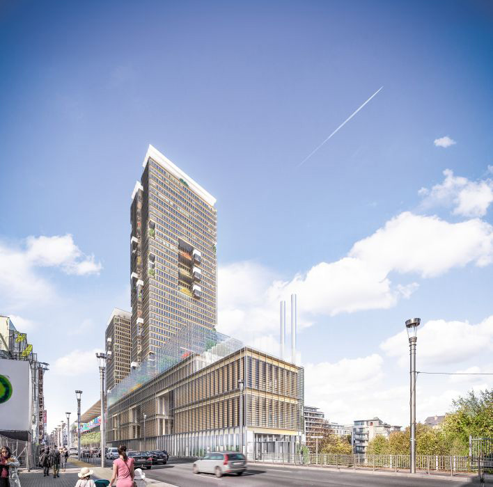
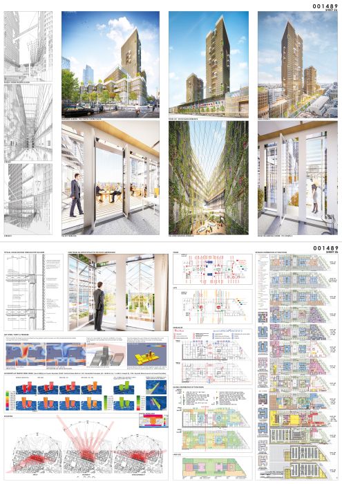
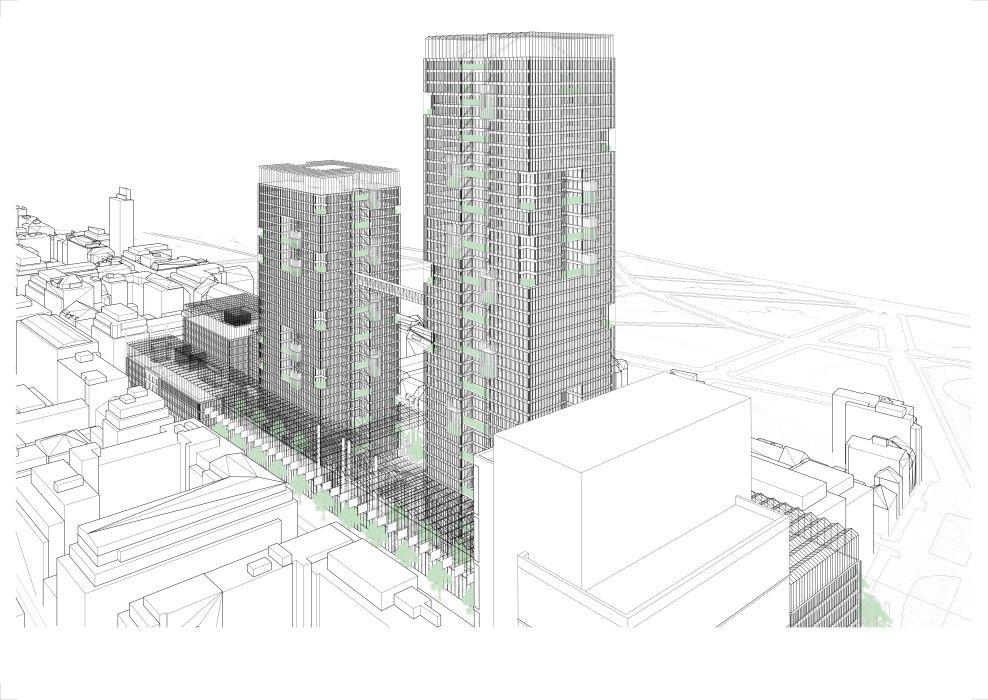
The new complex for the European Commission in Brussels is expected to maintain a place within the city representing its status for many decades. Thus the project strategy is based on an orderly and lasting built landscape, the form of which stems from its insertion into the urban fabric, its flexibility, its constructive rigor, and from its minimal environmental impact. Humanity, nature, poetry, creativity – thus life – may express themselves with maximal freedom within this arrangement offered by the constructed fabric.
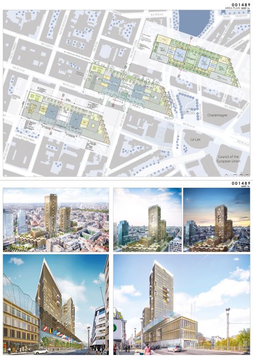
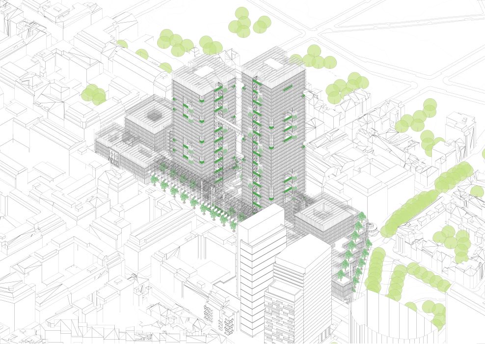
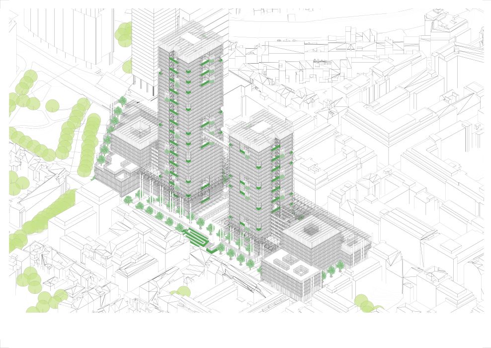
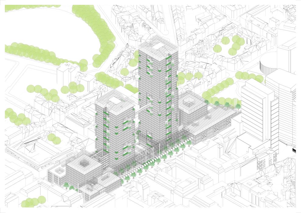
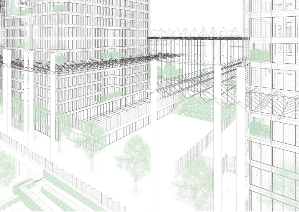
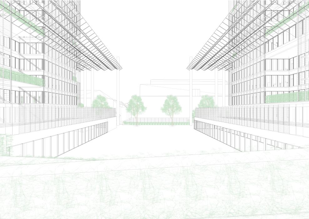
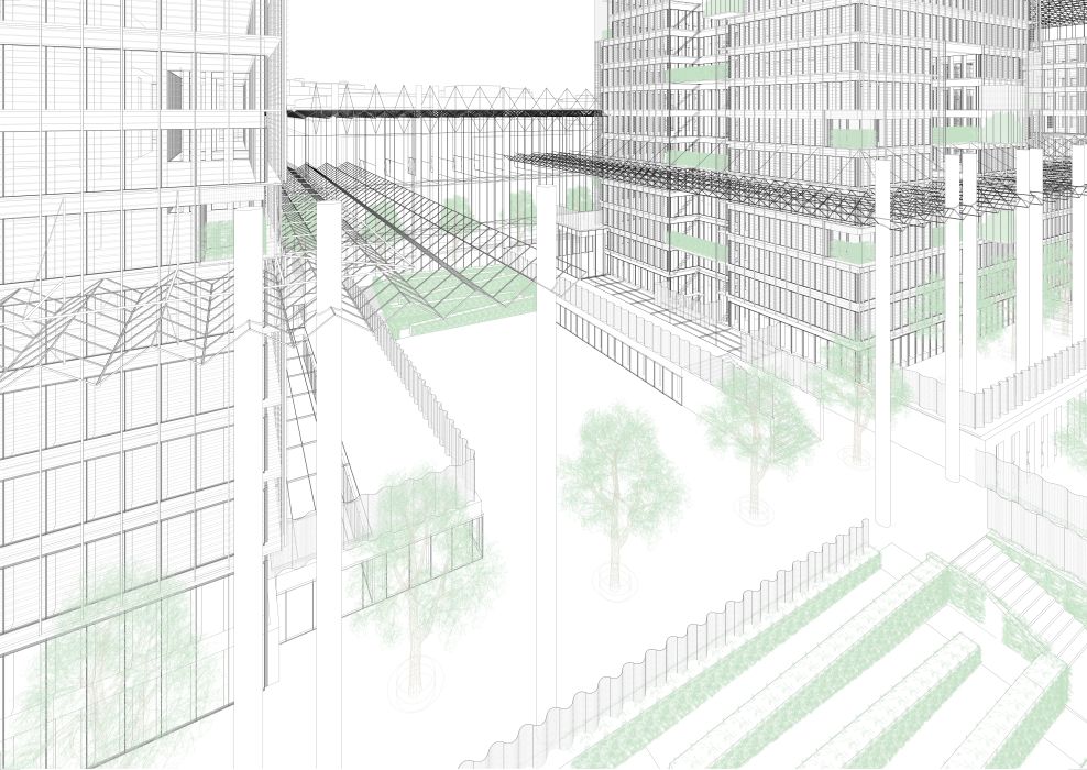
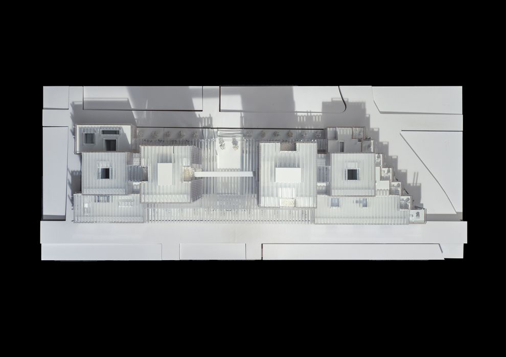
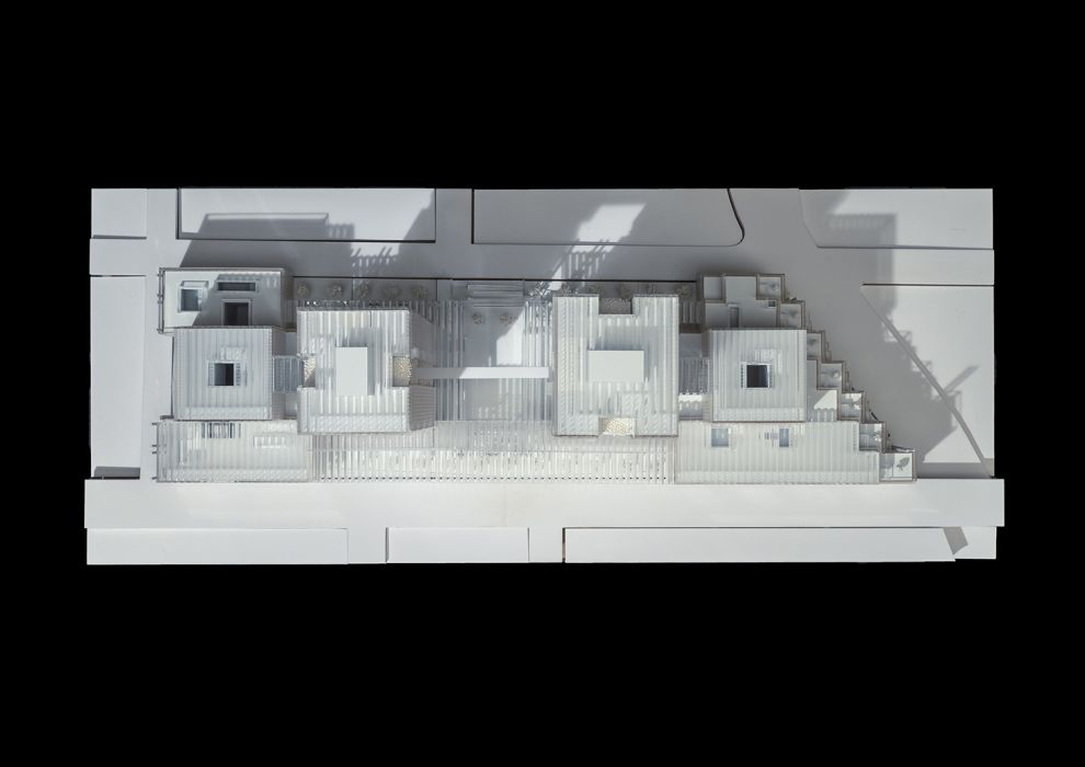
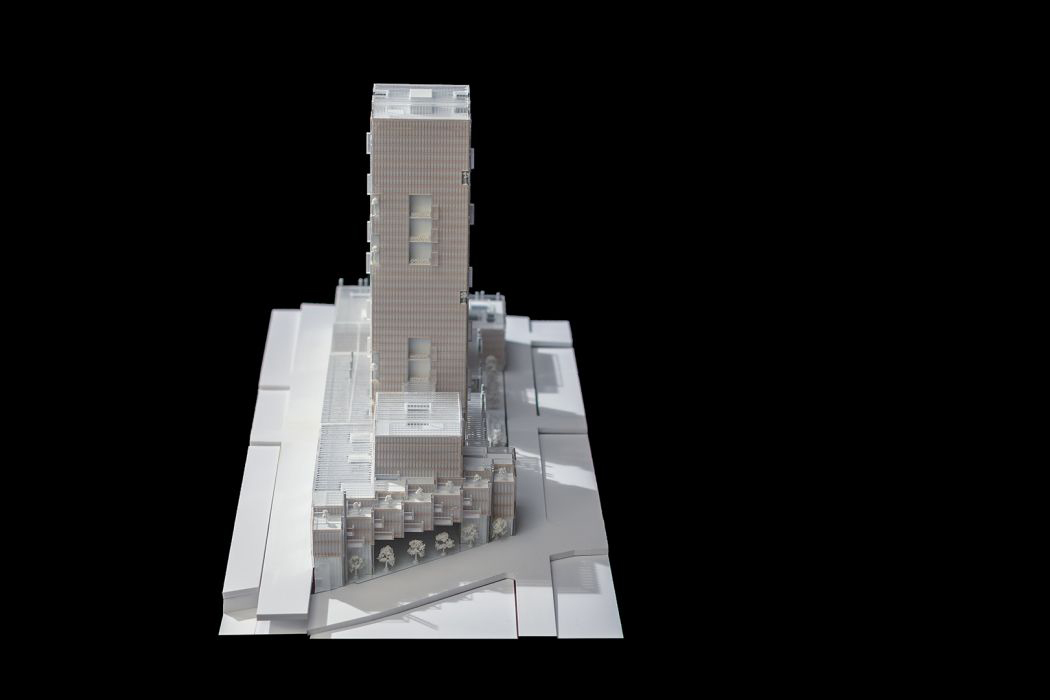
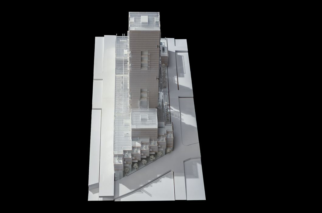
An open and permeable neighbourhood will be established implementing public spaces and addresses into the site along and inside its generous confines. It invites the citizens onto its central Welcome Piazza (I), which connects to and between the historically grown neighbourhoods. Here the flows through the quarter meet the access to the offices of the institutions for employees and visitors, to the metro, to the car and bicycle parking as well as to the nurseries.
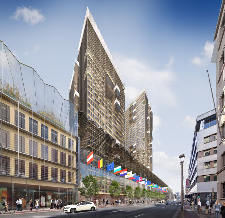
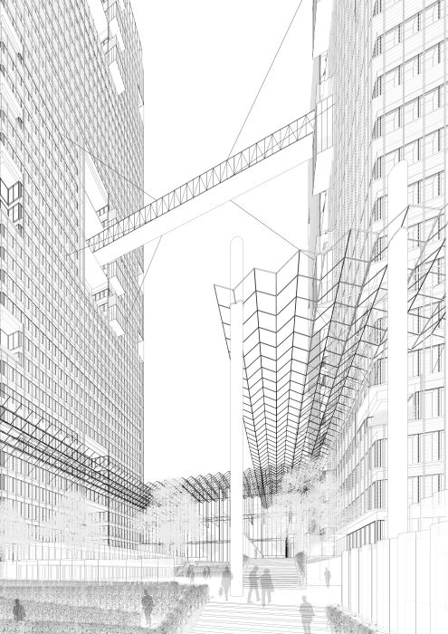
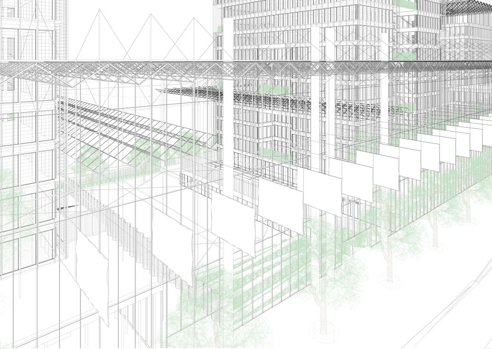
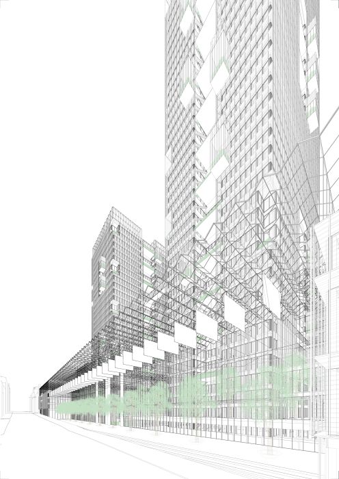
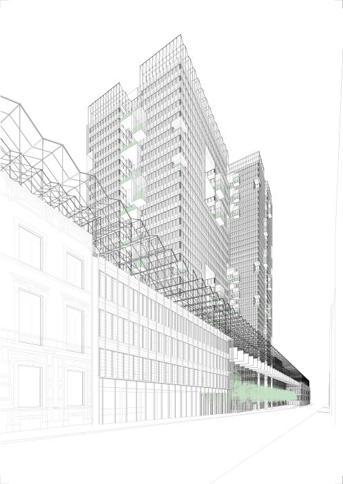
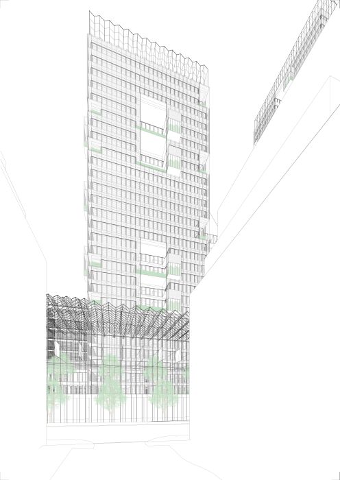
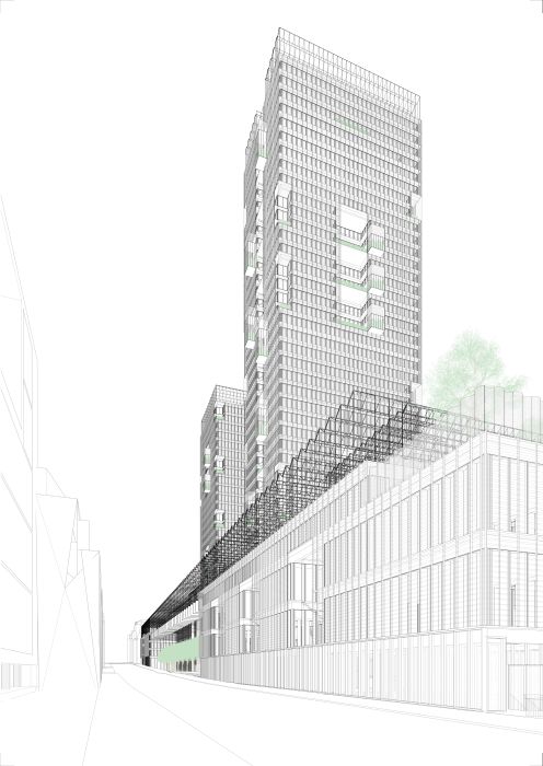
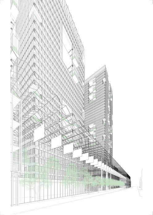
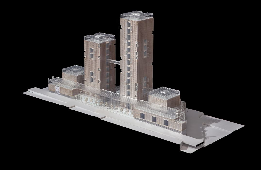
The attached Street Piazzas along Rue de la Loi (III) and Rue Joseph II (IV) will filter the existing city traffic, and by its generous width they will offer enough space for street life adjacent to retail activities integrating the flows of cyclists and passers by, thus traditional Market scenarios. The Southern oriented Street Piazza along Rue de la Loi is protected by a glazed awning – 145.8m-long and 24.3m-wide – at a height of 25.2m with integrated PV modules, which will balance protection against sun and rain, translucency, and its contribution of Energy for the buildings. The North-oriented Street Piazza opens to the adjacent quarter and provides access to the nurseries at street level in direct view from related drop-off areas.
Giving to the Maelbeek Garden as well as to the existing European institutional buildings, the spacious, covered Event Piazza on Chaussée d’Etterbeek (II) allows access to the Visitor Centre. Opening to Rue de Spa, the new “Spa Square” (V) offers places for repose and access to shops and restaurants.
Layout with Respect to the Sun, for Neighbourhoods and History
The volumes of the buildings are positioned with respect to their potentials and to mitigate their impacts on the environment – strictly within the limits of the regulations.
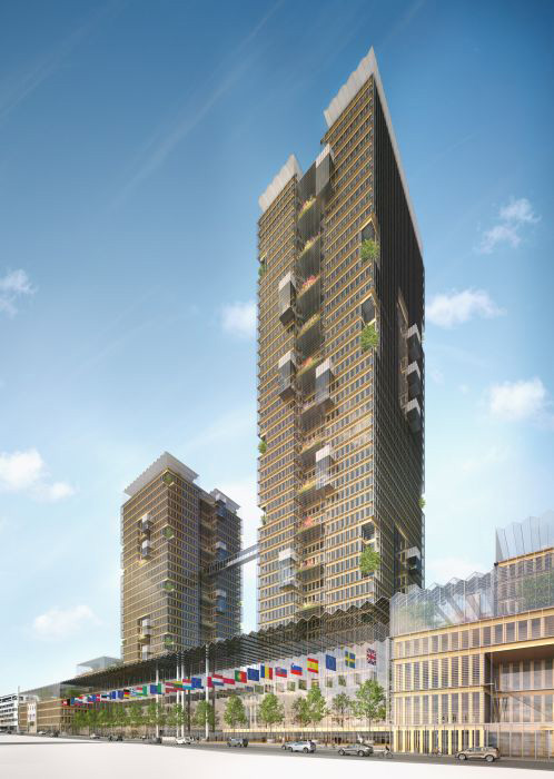
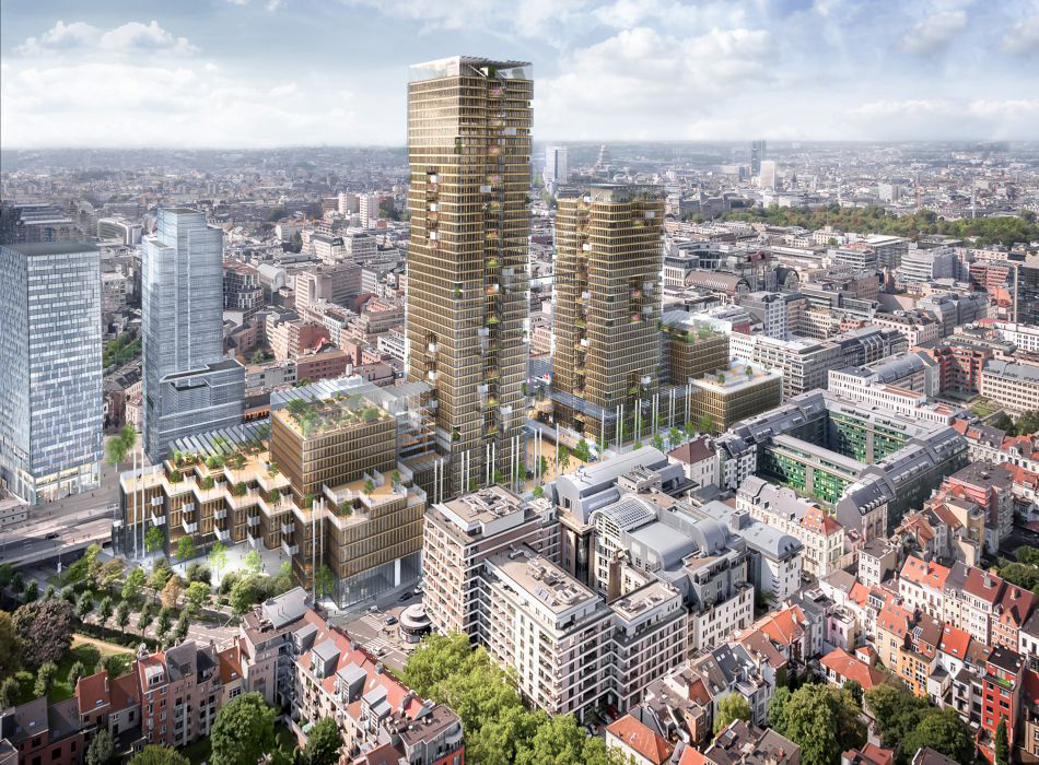
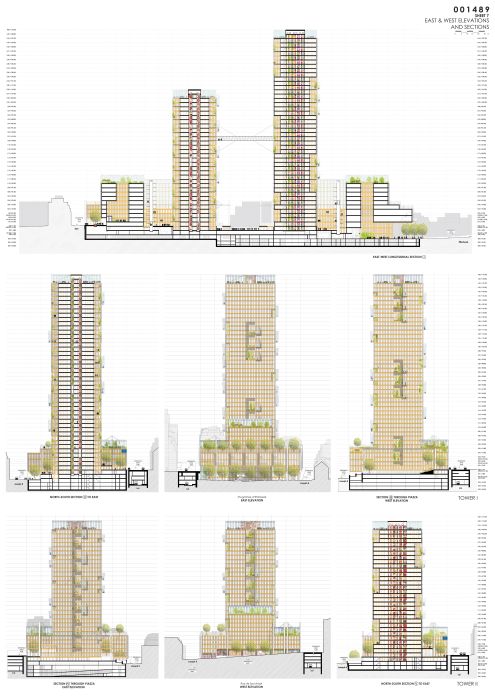
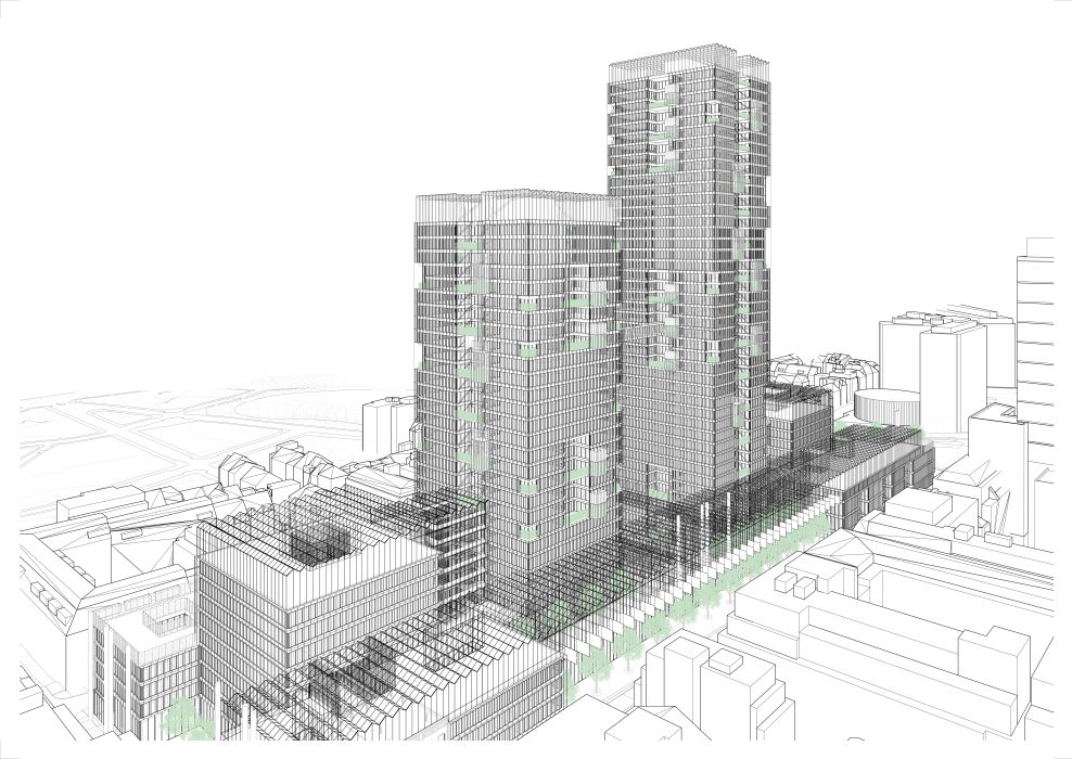
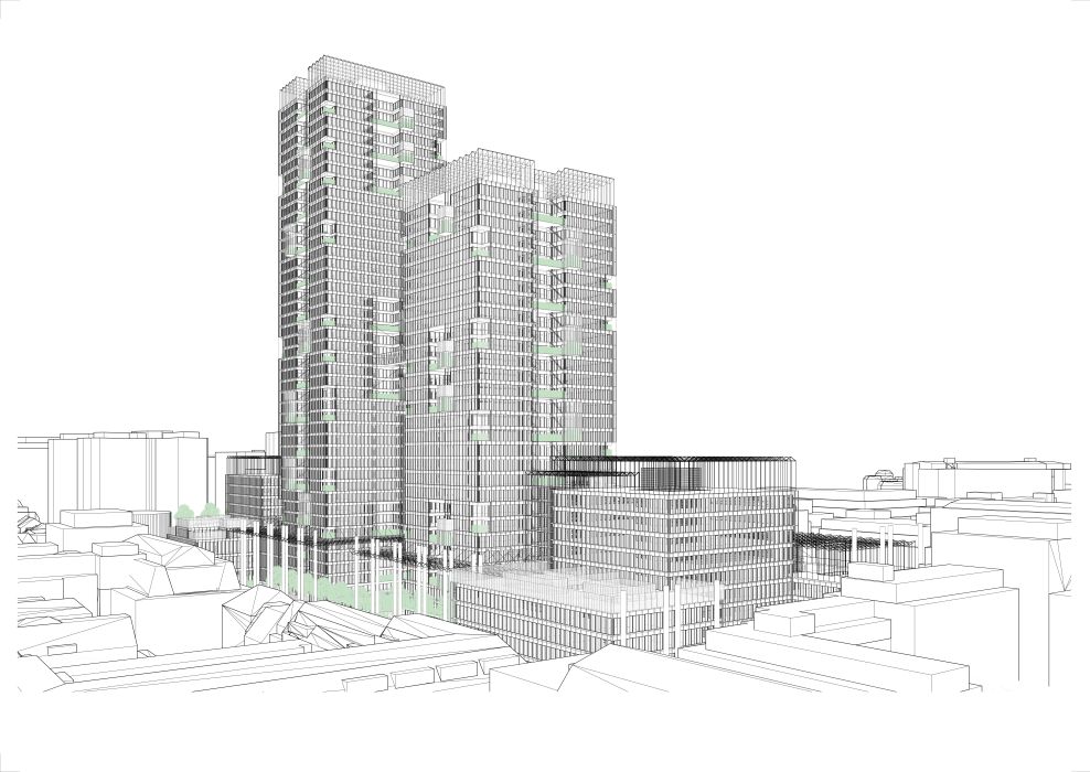
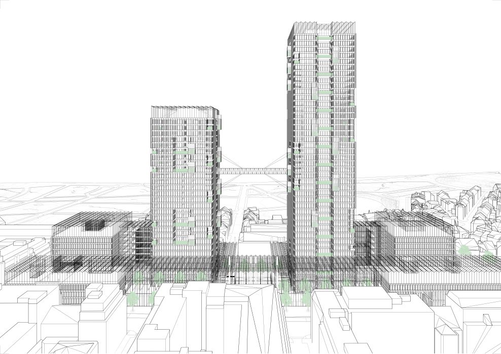
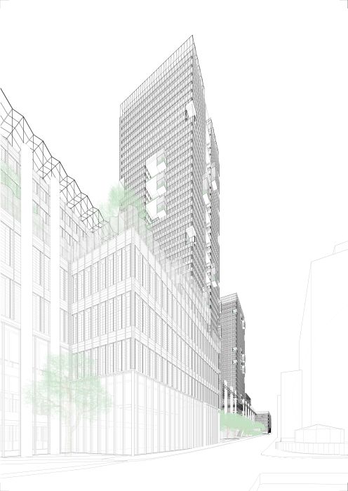
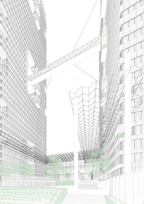
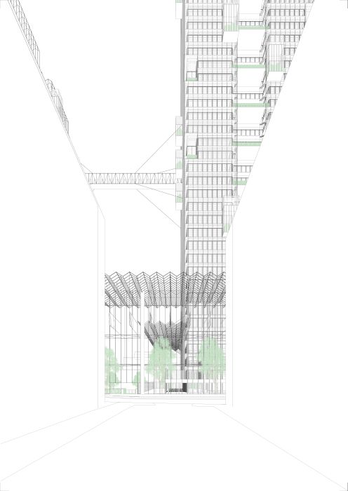
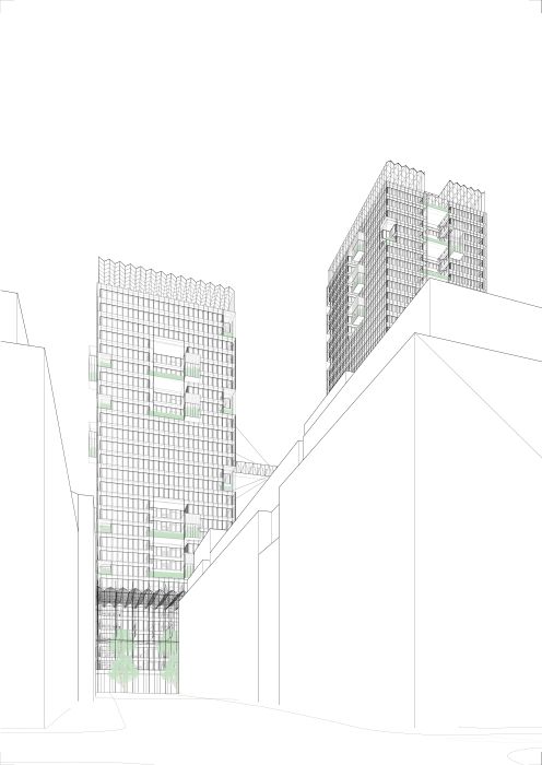
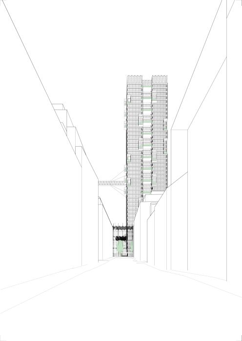
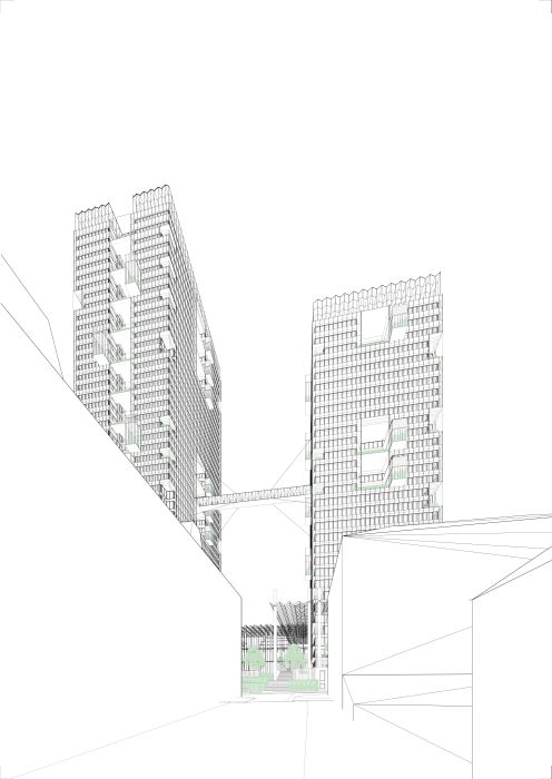
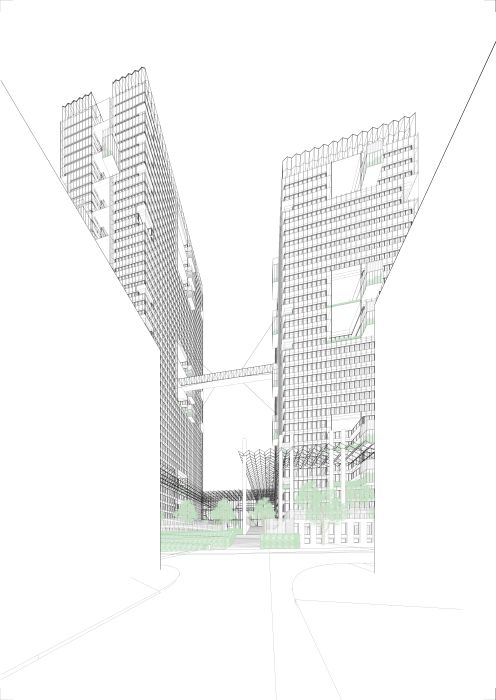
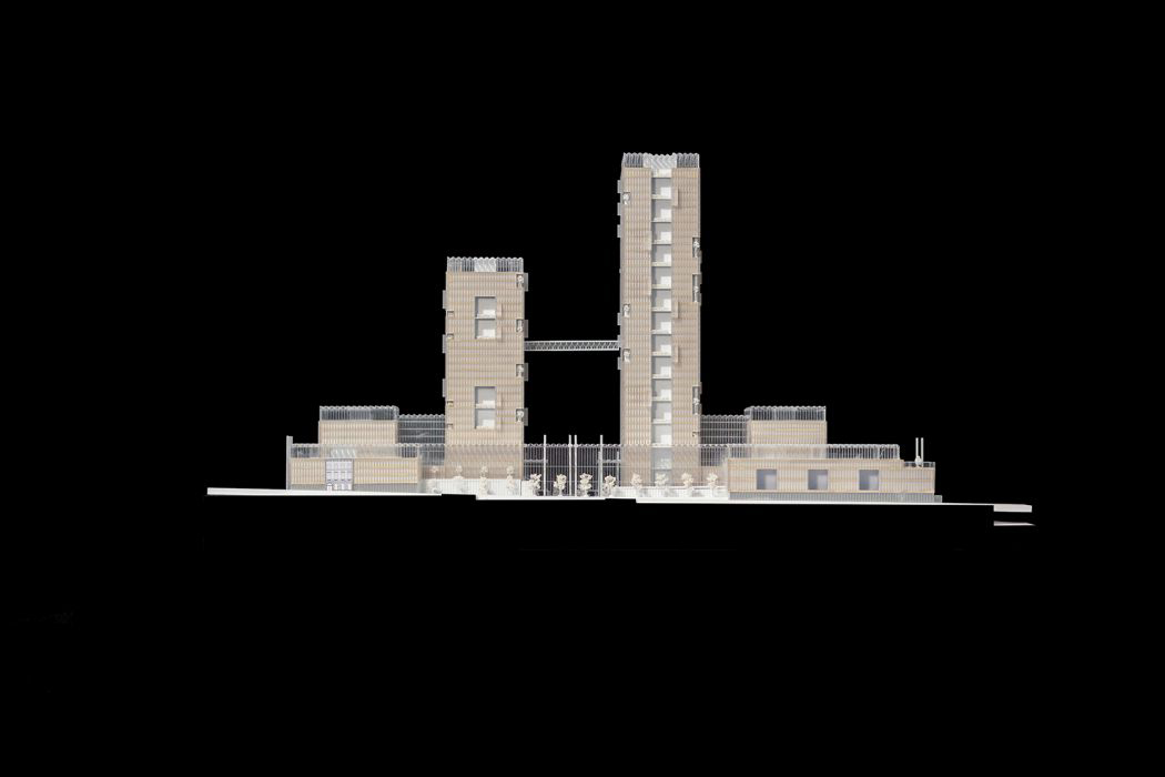
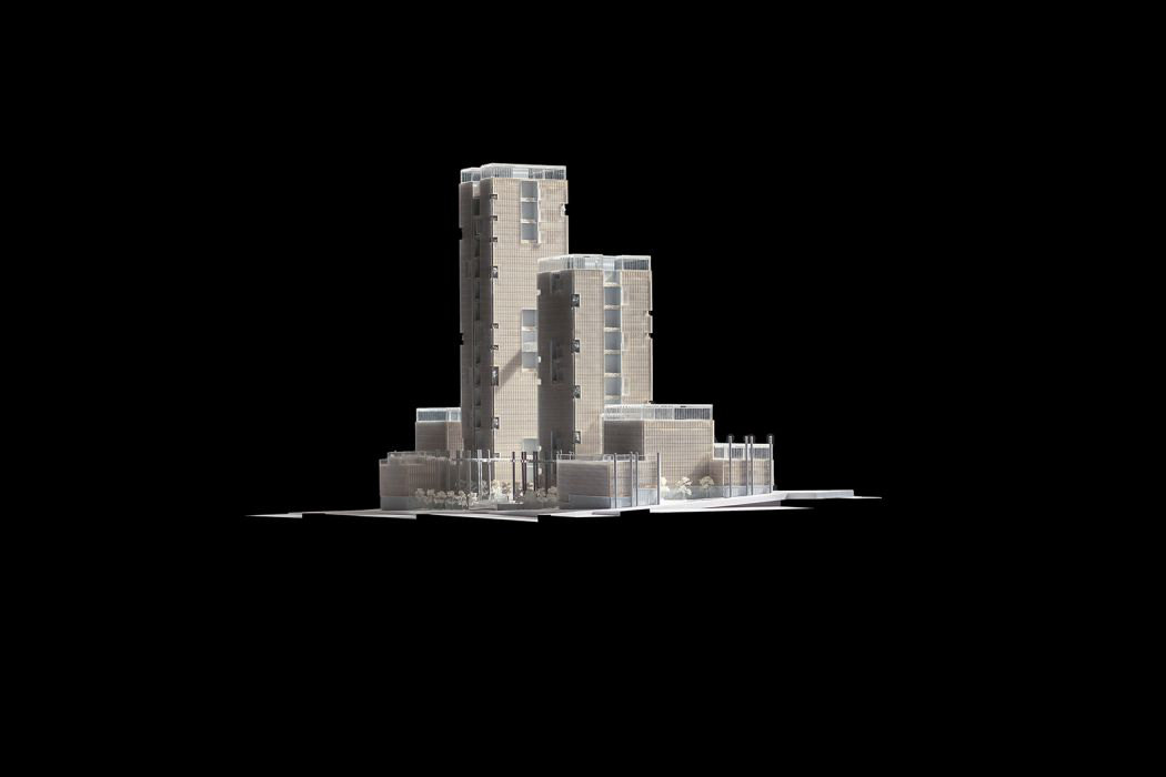
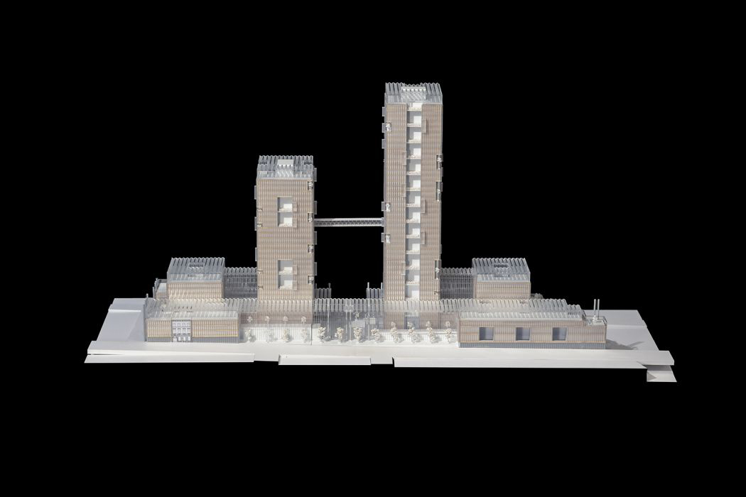
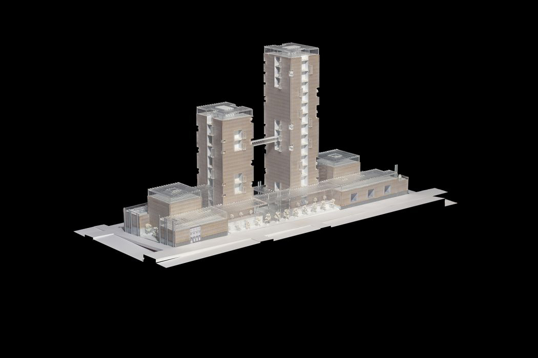
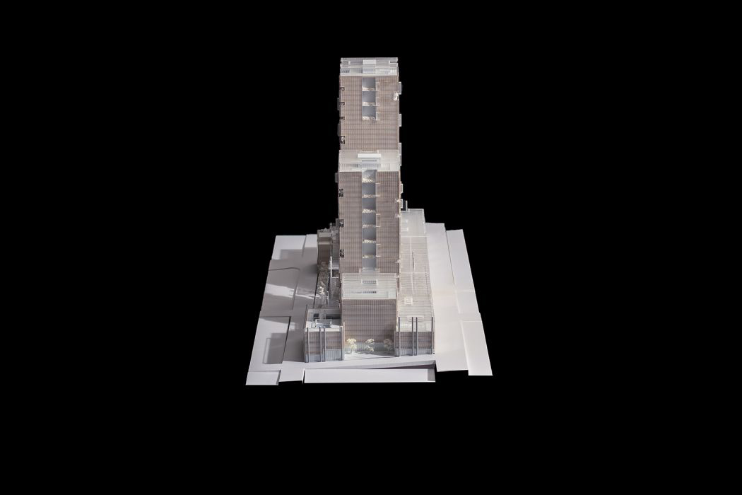
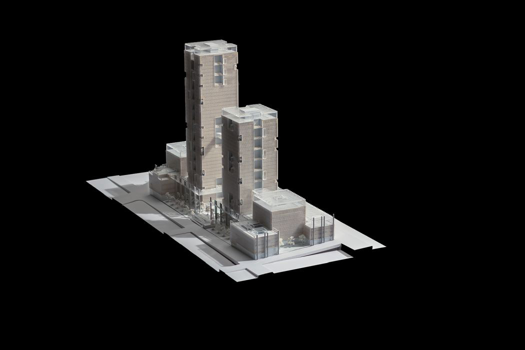
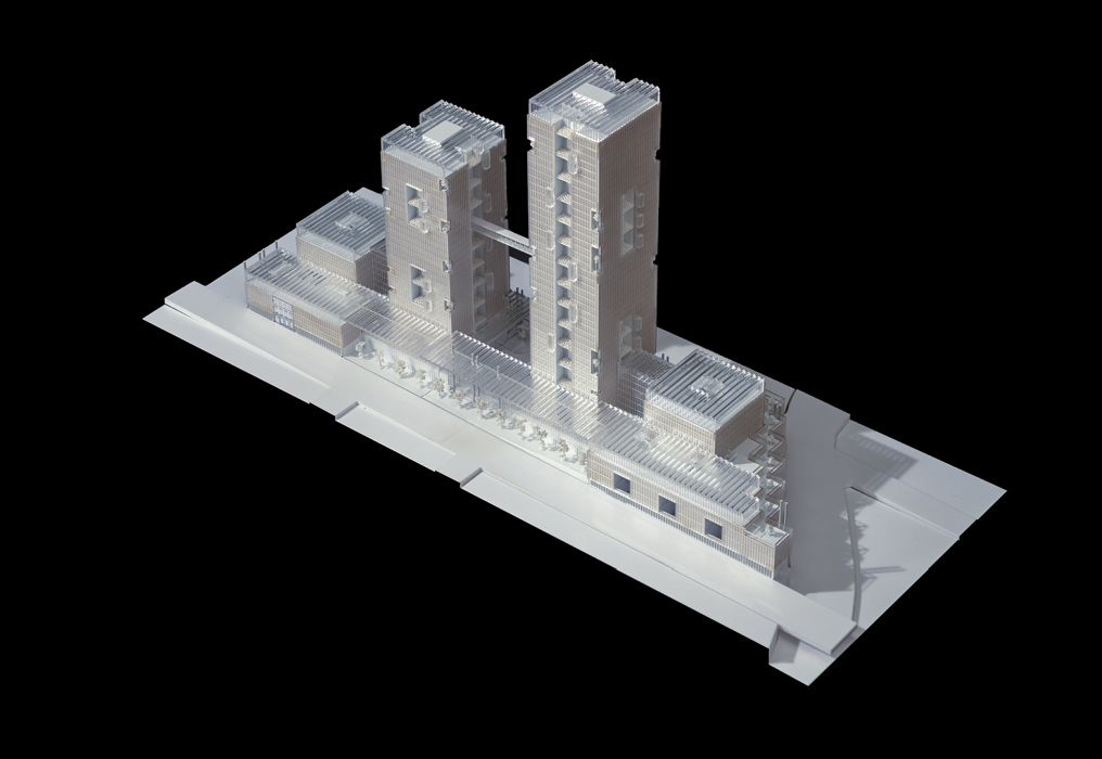
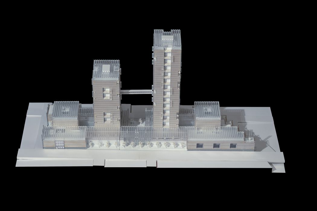
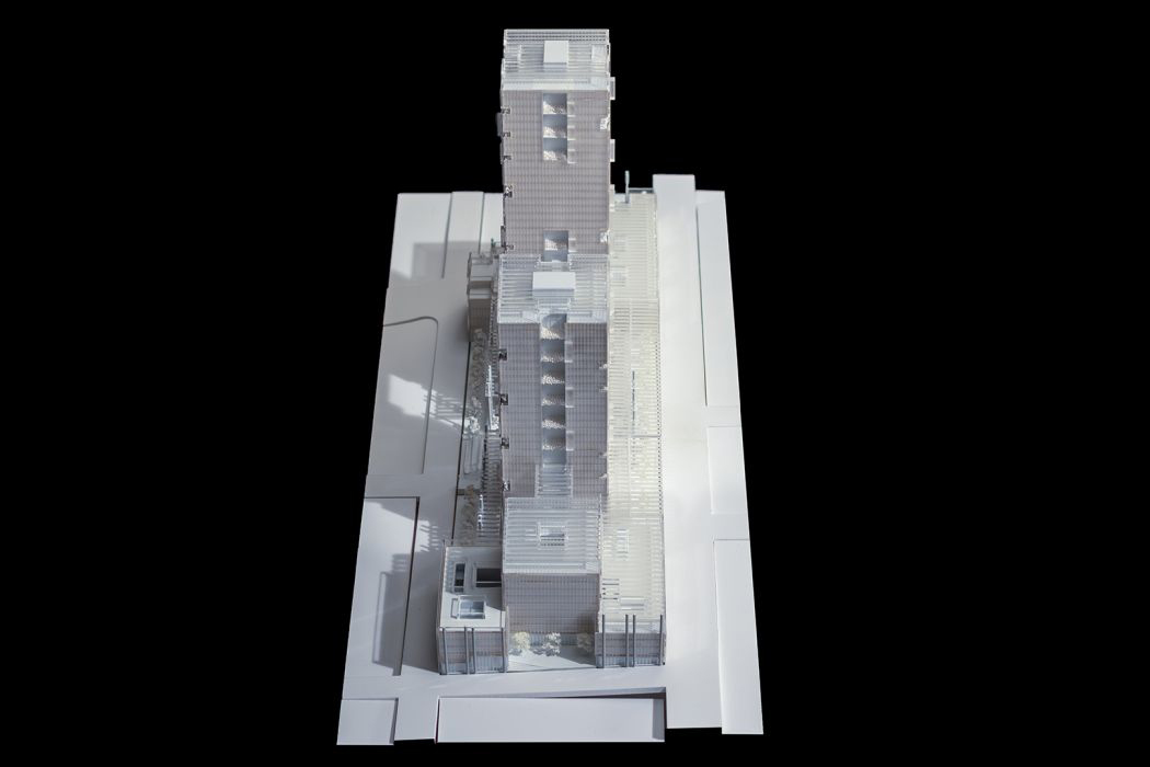
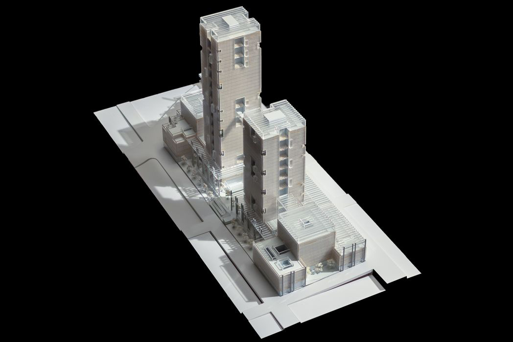
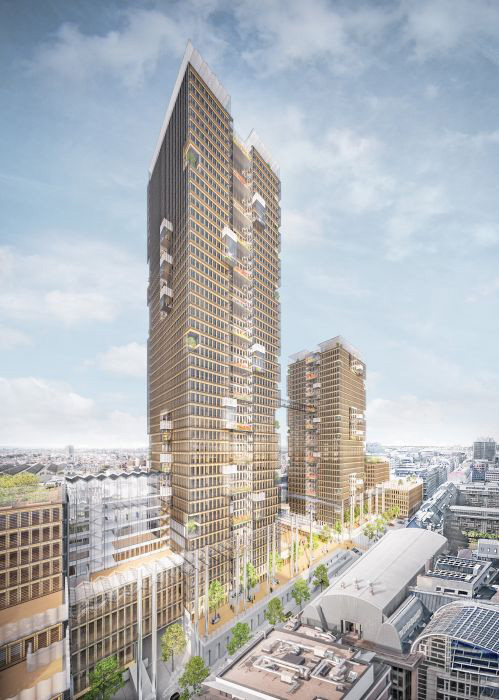
The two towers are set at a distance of 48.6m to limit the shadow durations and their visual impact for the neighbourhood, while still providing coherence of the towers as well as an economically reasonable connection between them above ground. Their absolute positions relate the low tower to the quarter in the North, and the high Tower to the quarter in the South of the site.
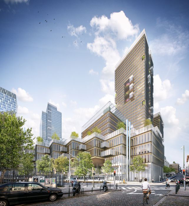
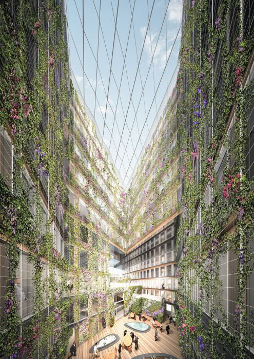
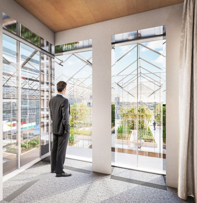
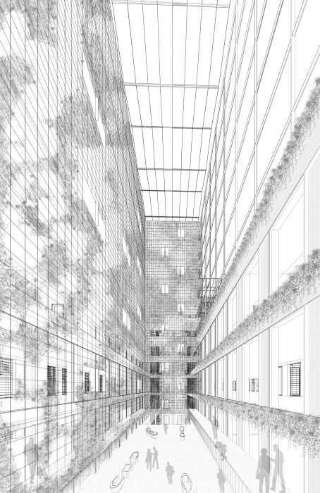
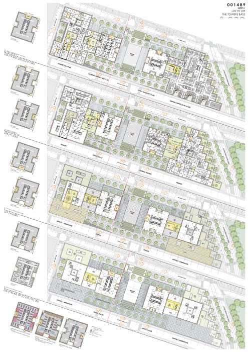
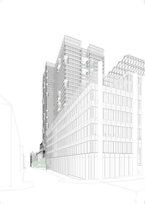
Two wings spread from the towers to their East and West sides respectively – connected by glazed atriums. These frame two lateral areas with peak buildings, each of them housing glazed greenhouses at their tops, further taming the impact of their heights. These bases extent on the East side along Chaussée d’Etterbeek, and on the West side along “Spa” as well as along “Loi” – also hosting glazed greenhouses at their tops and incorporating the historic building “Loi 78” into the arrangement.
The low volumes of the base buildings provide the foreground for the higher buildings behind – following the intentions of the regulations.
An environment free of noise, dust and wind
To enable a pleasant micro-climate in the buildings and open spaces, the wide awning along “Loi” that links the East and West base buildings is complemented by wide glazed awnings at a height of 16.8m starting at the North sides of the towers and returning onto a glazed vertical shield, which connects the two towers. All the glazing is made of crystal clear glass.
Fluid mechanic simulations as well as acoustic studies with real noise data from “Loi” and “Joseph II” on the BIM model of the project have confirmed:
- a wind and noise-free environment at pedestrian level in all the public spaces,
- a considerable noise reduction on the “Loi” North-facing buildings,
- a noise-free environment in the towers.
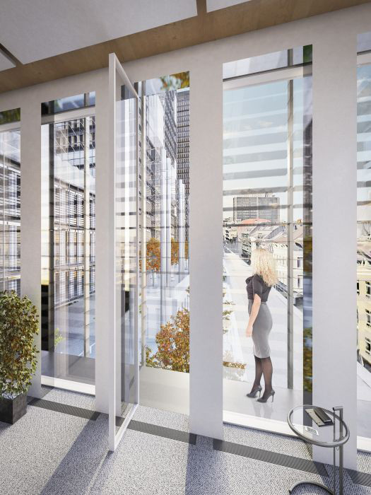
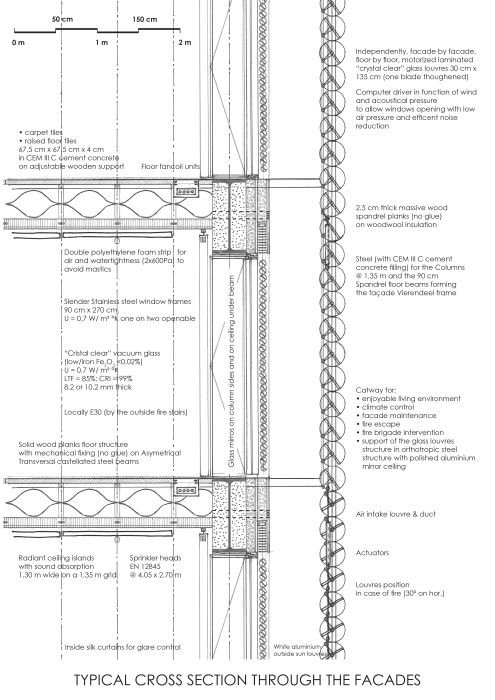
For the buildings, additional simulations have shown that, due to the installed glass louvres, air pressure will be low enough to allow window opening and natural ventilation with dust free clean air provided by the downward wind draft.
Public Open Spaces
In order to render the project friendly and acceptable into the city, more than 45% of the site area is conceived not only as open space, but as space open to the public. These areas are mainly hard covered and rhythmically structured by rows of trees planted in large vessels surrounded with benches.
Vertical gardens dress the public walls and the outlines of the slopes leading to the Welcome Piazza. At street level, all facades either give access to retail activities or – on the East and the West along “Loi” – to large diversity showcases. Although private, the greenhouses on top of the two “Loi” base buildings, providing the vegetables for the food courts and the flowers for the terraces, will by their vivid appearance and CO2 consumption positively contribute to the urban landscape. Semi-public spaces are integrated on the lower level terraces and in the top of the towers – in the EU Lanterns – that are open to visitors and thus mainly to the normal citizen.
A Site Facilitating Human Mobility
Smooth landscaping puts pedestrian life forward, in soft cohabitation with the flow of cyclists. Two gently sloped, planted paths to the Welcome Piazza particularly facilitate the accessibility for people with reduced mobility. To ease the flows of access and passage on the Welcome Piazza, a shortcut is implemented from North to South on the East side of the lower tower – its stairs being equipped with a sloped inlay for bike wheels.
Concise Access for Vehicles
Cars and lorries enter the building along “Joseph II”. Drop-off zones for two busses to the nurseries and four busses to the Visitor Centre are integrated along “Joseph II” and “Etterbeek” respectively, always visually related to their destinations. Safety and security vehicles access the building on both “Loi” and “Joseph II” sides. The firetruck find its installation along the retail units “Joseph II”, close to the fire lifts and escape routes of the towers.
ARCHITECTURE
A Wooden Corpus in a Diaphanous Clothing
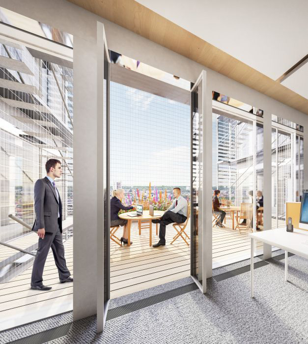
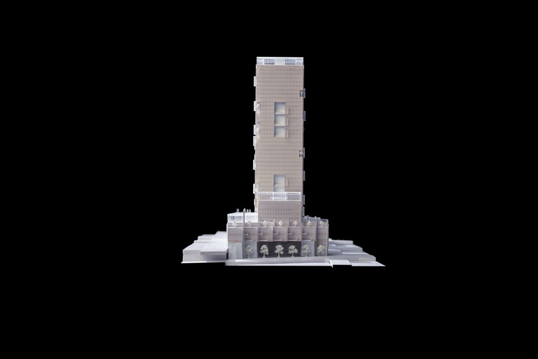
A wooden, steel supported corpus in a sheer wood and crystal clear glass envelope gently encases naturally lit and ventilated spaces, protecting them from the wind and city noise. Each floor benefits from flowered terraces.
Cultivated Nature
Culture refers to the soil but also to the mind. And from this culture, the project Loi 130 will display its fruits, both from the soil and from the mind, through an artistic interpretation of the cultivated nature.
The idea of Europe itself heavily relates to this notion. As a matter of fact, rather than progressing in isolation and letting Nature mercilessly choose the strongest, the European nations join their forces to cultivate a harmonious whole, just like an exalted, enhanced nature.
Several places are dedicated to this expression, in a manner both pragmatic and poetic:
– The aquaponic greenhouses produce food (vegetables and fish) for the restaurants as well as flowers for the terraces and, on a different level, mark the presence of the building within the city, like a crown.
– The showcases of biodiversity form facades of cultivated nature along the Rue de la Loi.
– The hanging gardens.
– The vertical flowered walls.
– The flower terraces on each floor of the towers, where flowers, vegetables and fruits are cultivated, tied to a selection of still life paintings, work of famous artists from the Member States.
– The corner terraces, carved out of the corners of the towers, with their abundant vegetation.
– The “art boxes” hung on the facades of the towers are quiet settings favourable for meditation and the contemplation of the works (still lifes, photographs, sculptures or any other artistic expression) made by contemporary artists from the Member States, each of them revisiting in their own way the notion of cultivated nature.
Relating to Human Scales
The large size of the site being 310m long, 84m wide and reaching a height of up to 164m, it is structured in a multi-layered approach to appeal at different scales. In analogy to the organization of a piano forte keyboard, the volumes of the buildings are organized, its constituents composed and refined in succession by order of magnitude, like the seven octaves of the piano keyboard – the km, hm, dam, m, dm, cm, mm – which are further refined in twelve notes respectively.
With the site’s neighbourhood at the km scale, the towers at the hm scale, the bases at the dam scale, the aims and the program of the project fuel the rhythms and the music of the project. The strategy for a pleasant environment in the tower floors expressed in the Piano Forte Analogy reads as follows:
- the dam scale corresponds to the large terraces every third floor as places of common gathering, the bridge between the towers at L20 and the glazed EU lanterns in the top floors.
- the m scale corresponds to the secondary terraces and “art boxes”, attributing an individual identity to each floor
- the flower beds on the terraces, the catways and the transparent glass louvres the mullions, spandrels and windows of the wooden façades introduce the further lower scales dm, cm, mm.
This down-scaling of the tower volumes turns out to be most beneficial for floor plan organization as well as for the physical performances of the construction.
The same scaling strategy applies to the public spaces:
- the natural ventilation chimneys of the parking, the trees rows, the stair and planted ramps flights, the undulating perforated vertical parapet screens, the glass canopies as well as the floating row of flags at “Loi”, for the public spaces;
- the plinth of retail and biodiversity showcases, the crown of greenhouses, the trees and flower beds for the bases.
A Site Organization Enabling Stepwise Evolution
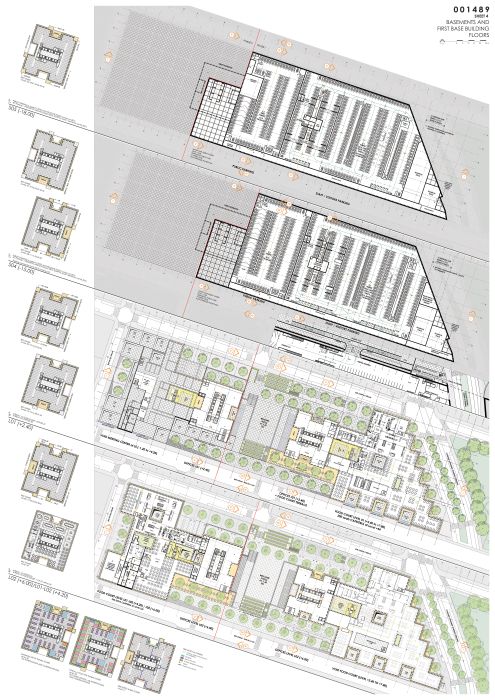
From the Welcome Piazza, the two reception areas on level S01 (with their mezzanine at L01) give access to the tower floors, and ATRIUM I (phase I) and II (phase II) to the Meeting Centres, food courts and Visitor Centre.
They also provide a secondary access to the nurseries, which are directly accessible from “Joseph II” as well as from the Welcome Piazza.
Staff accesses the Welcome Centre, and visitors the Welcome Piazza, from the EC car parks located under the East base (Phase I) and the west base (Phase II).
The public car park is independently located under the Welcome Piazza and accessed from “Joseph II” and the Welcome Piazza at the metro entrance.
From “Joseph II” (S03, Phase I, S02, Phase II), one reaches the loading bay access, the support zones, the food court and the service lifts.
The two 200 seats cafeterias with meeting rooms top the two towers.
Dimensions
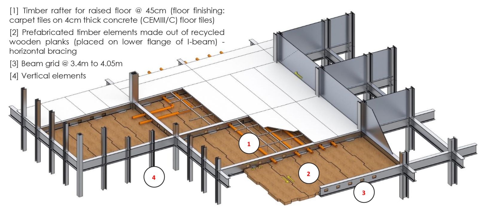
The plan is articulated on a 1.35 m square grid. The height of the floors is set up at 3.60 m, with a free height of 2.70 m. For some functions which need a high-density occupation, the height of the floors is increased: 4.80 m for the Visitor Centre, 5.40 m for the Food Courts and the Meeting Centres, 7.20 m for most of the shops. The height of the floors of the car park levels is reduced to 3.00 m.
Methodology
The project is entirely developed in 3D (Revit®) so that a perfect spatial coordination is provided and conflicts or impossibilities to superimpose spaces are prevented at the root.
CONSTRUCTION
Designing and Engineering with Respect to our Planet
The architectural and engineering approach aims for maximal sustainability in every respect. Some of the objectives pursued in the project lead to some proposals that hopefully will be perceived as daring, either technically or economically, such as, for example:
– the search for maximum materials savings,
– the search for a maximum dismountability of all the construction elements, including the structure and the foundations, in order to reuse them or, if it cannot be done, to recycle them,
– the most exclusive recourse possible to natural ventilation, with an extremely limited mechanical ventilation system restricted to high occupancy density rooms,
– the search for the lowest thermal inertia in the construction itself, taking advantage of energy stored in the ground and in large water tanks, and then only distributed where and when it is needed.
The interaction with the Commission at a later stage of the project development will allow to evaluate all the options proposed and to agree on alternative choices where needed.
In particular, the steel and wooden structure is a goal pursued for its great environmental qualities (low energy, dismountability, material savings, speed of installation, etc.), but is not an absolute. Taking into account the industrial context that will prevail when put out to tender, solutions like precast concrete floors bound with CEM III/C cement (85 % of slack) are totally conceivable and comply with the same technical guarantees.
The new offices of the European Commission will be an attempt to showcase its respect for the planet, with the help of culture, art and poetry, supported by science and technology.

