164
EUROPA
But the painters? They define their own vocabulary, their own syntax. Georges
Meurant provides a good example. His painting, he explains, “experiments with
colour without any other goal than to induce a spatial function through multiple
relationships between colour and structure”. The painter speaks of
induction
figurale,
“singular energetics, discontinuous but inexhaustible as long as attention
lasts, which realises the transmutation of the perceptive space by the unpredicta-
ble sequence of aggregations and disintegrations of shapes…”. Georges Meurant
deploys huge compositions of rectangular figures coloured in flat tints: they are
contours, neighbourhoods, interactions that produce dynamic effects and set in
motion the perception of space. The meeting with Philippe Samyn soon proved
to be productive. The architect asked the painter to decorate the building on the
inside.
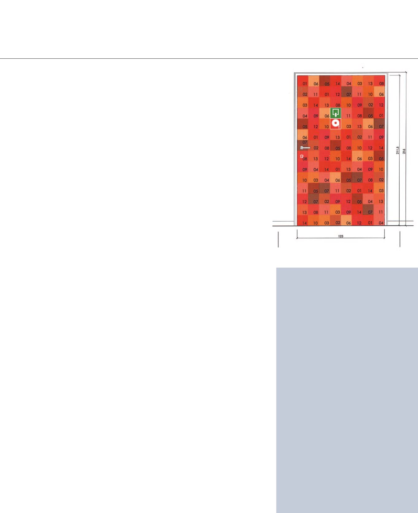
The principle of the decoration of the doors, an orthogonal polychrome grid,
was rapidly extended to rugs, ceilings, walls. These décors are coordinated in ac-
cordance with the dimensions of a modular framework. The coloured cladding is
featured respectively in felt squares (for the panels in the suspended ceilings), in
rugs (merino wool with 250,000 knots per m
2
, i.e., 500,000 strands), printed on
film (for lift shafts), in laminate (door cladding).
Signage is kept tidy thanks to the dimensional framework of 15 x 15-cm mod-
ules, in squares on all doors, each square in a different colour. Colour codes are
adapted locally to safety requirements, i.e., access to fire hydrants, emergency
exits, door opening direction. All pictograms comply with this logic. The coloured
frames make up a system, they are there to curb the proliferation of parasite al-
beit statutory signs, which, all together, stir up true visual anarchy. For the same
reasons of signage coordination, the soffits in the corridors feature a 15-cm verti-
cal edge.
Colours, for example, are abstract, concep-
tual colours, whose shades do not count.
Red, which takes on the name of
gueules
in the French vocabulary of the blazon, can
be translated into carmine, garnet, blood or
vermillion. It is of no importance and has no
meaning. What matters, is their axis, their
position, their distribution, the stacking of
planes, the articulation between top and
bottom, the front and the back, the centre
and the perimeter, the right and the left,
the profile and frontal.”
Michel Pastoureau
,
« Pas de marron dans le
blason »
in
Laurent Joubert,
Demain quels drapeaux.
Le livre des Trophées de paix
, Ed. Yellow Now, 1996.
Book written on the occasion of the completion and
installation of polyptychs by the painter Laurent Marie
Joubert, in the Justus Lipsius building in Brussels.
DECKS, LANGUAGES AND COLOURS


