Page 224 - AGC_EN_iBook
P. 224
224
ThE DECOR
I paint polychromes based on a balance of reds, yellows and blues, and steer away from white and black. My aim is to achieve a combination of colours that constantly rede ne themselves while the viewer looks at them. My painting attempts to induce a con- stant transformation of forms (what I call ‘ gural induction’), mul- tiplying them by rede ning their contours.This is my way of inno- vating, and my painting identi es form by colour. Coloured mono- chrome squares and rectangles, arranged at right angles to each other, cover the building’s supporting structure, i.e., taking me from the colour to the resulting structure.This ‘matrix’ of colours is devoid of thickness, width and depth, merely a collection of jux- taposed forms, at the edges of which one colour ends and another starts.The chromatic tensions at the contours give the matrix suf- cient autonomy for it to subdivide itself into subsets grouping forms in various contrasts or similarities, thereby inducing gural associations by translation and ampli cation.Their dissociations are caused by the irregularities of the matrix and prompt view-
ers to look at them in different ways. My painting simultaneously combines three types of contrasts or similarities deriving from the properties of each coloured form (hue, saturation and brightness), but also from the material properties of the colour (texture, grain) or the way it has been applied (thickness, lacquers). Such variables determine the associations and dissociations, the junctions and disjunctions behind the gural permutations, whereby each gure represents the form de ned by its contour.
In January 2013, Philippe Samyn asked me to design a composi- tion of large, monochrome elements.This was the tenth time I
had worked with him since May 2010, when I rst agreed to sub- ject my pictorial experiments to the constraints inherent to the applied arts.You would never nd me working on any inert decor. Moreover, there are just as many works belonging to the applied arts as there are works of pure art.The distinction between an artefact (i.e., a work of applied art) and an oeuvre (i.e., a work of pure art) lies solely in whether the activity involving the work is continued or abandoned once the artist has nished the work.This new project will be the rst one actually completed – the building is scheduled to be inaugurated in the autumn. Under Philippe’s
supervision, I am also working on the interior decor of the new headquarters of the Council of the European Union currently being built in Brussels (7,550 m2 of coloured felt patchwork ceilings and an equivalent amount of wool carpeting for the conference rooms, 2,500 m2 of photographically reproduced compositions for the lift shafts, and about 1,000 doors) and the behind-schedule erection of a tower on an island in the East China Sea opposite Zhoushan, at the entrance to the Lujiazhi Cultural Creativity Garden.The tower is being built by Philippe SAMYN and PARTNERS at the invi- tation of the architects Wang-Shu and Lu Wenyu. The east and west facades will each have 1,000 m2 of compositions painted on metal in accordance with my designs, with a huge perspective, and a third composition (180 m2) at the foot of the west facade with a smaller perspective. With my work focused on exploiting universal perceptual re exes, it would be great for it to mark the entrance to a public place in the Far East.
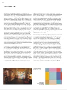
I was tempted to give these monochrome compositions a bit more momentum, illustrating the diffraction of light through sequences of rainbow-coloured pixelated squares (each c. 15 x 15 cm), run- ning from the south wing (red) to the north wing (blue): 400 m2
of translucent printed fabric ‘frescoes’ on a white background stretched across the walls of the main lobby of the future AGC Glass Europe headquarters in Louvain-la-Neuve, helping peo-
ple to feel at home in this vast space. I composed four pairs of ensembles with different dominant colours: red (from magenta to orange), yellow (from ochre to cinnabar with touches of pink and blue), green (plus a few touches of red and blue) and blue (with a few greens and pinks added). My work was accepted in mid Febru- ary.The rst challenge was to emphasize contrasts and similari- ties through small differences of colour brightness, intensity and saturation.Then came the execution problems. I was satis ed with the life-size tests on fabric. But I was then presented with a design submitting the ‘ gural induction’ to the test of an additional ampu- tation of factors essential for its functioning, i.e., the colours.The windows of the conference and meeting rooms had to be partially covered, creating a ‘sheltered area’ isolating participants from the outside world without necessitating too much arti cial lighting.
the studio of Georges meurant (2008-05-03)
Painting, 2011, oil on wood panel, 200 x 200 cm